100% CSS3 Slider?
Make amazing image sliders totally in CSS. Zero jQuery, zero JavaScript, no image icons, no programming! It's amazingly smooth, light, responsive, and retina-ready. Runs fine on all current devices and browsers. Fade, Slide, Zoom, Ken Burns transitions and some skins are accessible. Download a free slider maker for Windows and Mac now!
Eye-catching themes
Select skins, colors and effects from your astounding library that is integrated and prepared to go.
Simple to Use
User-friendly, you just assign a variety of templates, colors and transitions from the library to your own slider. There is absolutely no comprehension of programming required at all. You won't need to type a single line of code!
Absolute CSS Slider
Forget about any JavaScript - this picture slider is made with CSS and HTML exclusively
100 % Pure CSS
cssSlider is exclusively CSS powered (no JavaScript, no jQuery), so it's going to play in any web browser, without needing any additional script libraries.
Extremely Customizable
Run css Slider web builder in two different settings modes: Basic and Advanced. Select from numerous built in layout looks to keep things real simple, or dive into edit the settings in whatever way you'd enjoy for full control.
Retina-ready
The slider bullets, play/pause, prev/next and other controls are vector icon font, making them monitor size independent and excellent for retina high-res displays.
Automated Cropping and Sizing
No need for separate picture editing apps. The cssSlider immediately crops your photos and resizes them to fit whatever size you specify!
No-jQuery Slider
Forget about heavy and slow jQuery containing a lot of unused code
Drag and Drop
With the drag-n-drop, cssSlider couldn't be simpler to use. Drop and delete images, change the ordering, embed sliders in seconds.
KenBurns Effect & Basic Layout Non Jquery Slider
This skin has a simple, minimalist feel that is clean and welcoming. The design uses only CSS, no JQuery or Javascript, which makes it incredibly quick to load, completely responsive and can be used on a wide variety of platforms, even ones with javascript disabled.
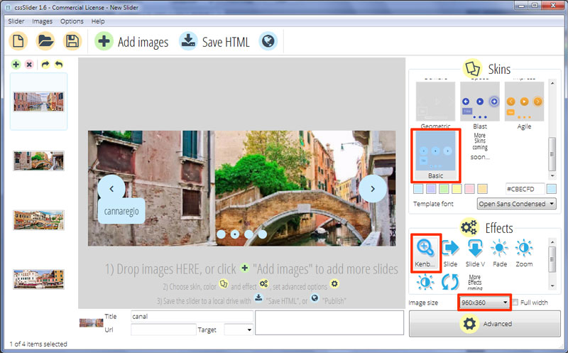
It uses two shades of pale blue and dark grey, which stop it from feeling too stark and simple.
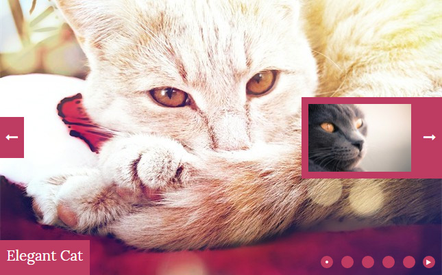
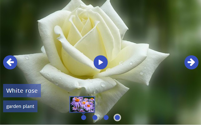
There is no frame around the slider, which means images take center stage. Two navigational arrows display when you hover over the image. They seem drop into place from above, with a smooth fade. It is a slow and smooth transition effect. The arrow is a dark grey, thin arrow-head. It sits on a pale blue circle. Hovering over the arrow turns the circle white, and the arrowhead shifts left and right. The movement attracts the eye, and encourages the user to click on it.
Clicking on one of the arrows cycles the user through the images.
In the bottom-left corner is a caption, comprised of two titles. They both have grey text on a blue rectangle with rounded corners. The title rectangle is a slightly darker shade of blue, and the sub-title rectangle is a grey-ish, very light blue.
The title bounces in from above, and comes to a stop overlapping the sub-title rectangle. The sub-title bounces in from below. The text inside bounces even more, creating a realistic sense that the rectangles have come to a halt, and the inside text has been shaken in response. It is a very attractive and eye-catching transition, which still maintains the simple and clean design style of the template.
The font used is Open Sans Condensed, a humanist sans-serif typeface that is neutral, simple and yet friendly.
At the bottom of every slide are a number of blue circles. Each one indicates an image in the slideshow. The circle that represents the image on display in the slideshow has a grey dot in the center.
Hovering over a circle causes a preview image to display in a blue frame, and with a blue arrow at the bottom pointing to the correct circle. This preview image slides into place from above, in the same way as the navigational arrows.
Clicking on a circle loads the relevant image into the slider. This is a greta way to allow someone to navigate to the image most relevant to them.
The change effect on this demo is 'kenburns', a modern, simple transition where each image slowly zooms and fades into the next one. It is a change effect that creates a sense of constant, relaxed movement, like you are watching the world slip by. It works effectively with the simple but modern slider design.
This design is flexible enough to be used for almost any website that wants a modern, clean design. It is extremely professional looking, and would be perfect for technology websites, website builder software companies, and so on.
