


Zoom Out Animation & Rhomb Skin Slideshow Jquery
This slider template invokes a classic simplicity, the kind of design that manages to be both beautiful and highly functional. It uses white and a bright blue that lifts the whole design and adds a dash of individuality.
The slider template is fully responsive, and looks stunning both on a widescreen monitor and a smartphone screen. The template has been carefully optimized for each breakpoint, with functionality reduced at smaller screen sizes to increase clarity and simplicity of use.
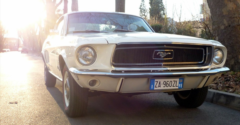
On the ‘full screen’ version, the images are a standard ratio that is flexible and works well with a wide variety of photographs and other visual content.
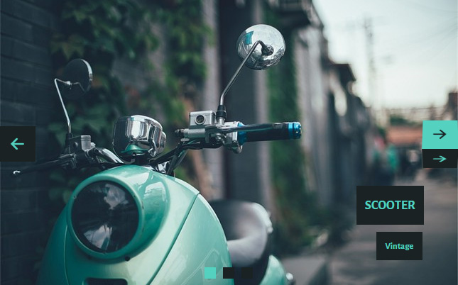
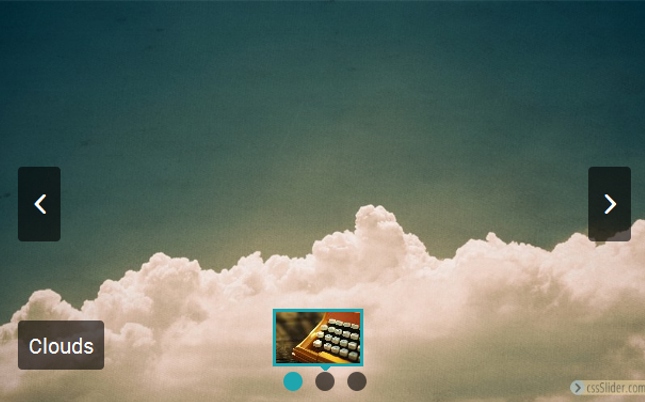
At the top center of the slider is a series of transparent squares bordered with white. The corners of each square and very slightly rounded, giving the design an organic, friendly feel. Each square represents one of the images in the slideshow, and when the relevant image loads, the square turns into a blue diamond, still with rounded corners. It’s an excellent piece of UX work, that helps reinforce the purpose of the squares to the user.
By hovering over one of the squares, the user can bring up a preview of the other images in the slider. Each preview is contained within a thin white border. Clicking on the square loads the image into the slider. The square allow the user to skip ahead to any image within the slider, without needing to wait for them to run through in sequence.
In the bottom left corner is a caption. There is a title, in blue text on a semi-transparent white rectangle with rounded corners, and a sub-title in white text on a blue rectangle. The font used is ‘Bitter’, a serif font that was designed specifically for reading on a screen and which is extremely legible even at small screen sizes.
The caption explodes into place, with the title leading and the sub-title following slightly more slowly. The transition effect is very attractive and eye-catching.
When the user hovers over the slider, two navigation arrows appear at either side of the image, and a pause button appears in the center.
These icons are all white, and contained within a transparent square with a white border and rounded corners. The icons all drop gently into place along a vertical axis.
Hovering over any of the icons turns the square on it’s corner, to become a blue diamond. This mimics the squares at the top of the slider, and is a nice sign of consistent design choices.
The transition also encourages people to click on the icons. The navigation arrows allow people to cycle through the images in the slideshow, while the pause button allows them to stop the slider on one image.
After pressing ‘pause’ the icon transforms into a play symbol. Clicking the icon again starts the slider going again.
The images themselves have a very nice transition effect when they switch from one to another. The current image slightly lifts and then pulls back, shrinking down to a dot and disappearing. It reveals the next image behind it, which slightly lifts into place.
The whole effect is extremely natural and smooth.
Overall, this is a fantastic slider theme, that could be used across a wide variety of websites.