100% CSS Slideshow?
Create gorgeous image sliders fully in CSS. No jQuery, no JavaScript, no image icons, no scripting! It's amazingly fast, lightweight, responsive, and retina-ready. Works perfectly on every modern devices and internet browsers. Rotate, Pan & Zoom, KenBurns, Fade, Slide effects and a few flat skins are available. Download a slider builder for Windows and Mac now!
Additional Features
There's a great deal of configurations that you may tweak, including perfect transition effects and vibrant flat designs, prev/next navigation, bullets with thumbnails, auto-play, pause/stop, full width, full screen and additional options.
100% CSS Slider
Forget about using any JavaScript - this picture slider is made with CSS and HTML exclusively
Extremely Customizable
Run css Slider website builder in two distinct configuration styles: Basic and Advanced. Pick from several built in layout looks to keep things real simple, or dive in to edit the settings in whatever way you'd like for total control.
Any kind of colors
CSS Slider doesn't utilize images for styling so the skin color can be conveniently switched
Liquid slider
Liquid slider matches wonderfully to your page, despite of the screen dimension
Automated Cropping and Sizing
No more need for separate picture editing applications. The cssSlider instantly crops your images and resizes them to match whatever dimension you define!
Lightweight and compatible
Turbo page speed is a certainty because it is not getting slowed down by JavaScript, along with being designed to the most up to date technical guidelines to make it super-compatible.
Retina-prepared
All slider navigation controls are vector font and they are perfect on hi-res screens
CSS3 transitions
Silky smooth hardware-accelerated animations work much better than jQuery ones, especially on mobile gadgets
Zoom Transition & Demure Skin Non Jquery Slideshow
This carousel has a modern, stylish design. It uses white, orange, and black to great effect and by using semi-transparency the designer gives the slider a modern edge. Because the design is stylish and eye-catching, it would be great for fashion designers or journalists, or fashion bloggers. It would also work for a stylish and elegant restaurant. Indeed, any company that wants to create a sophisticated brand could use this slider design.
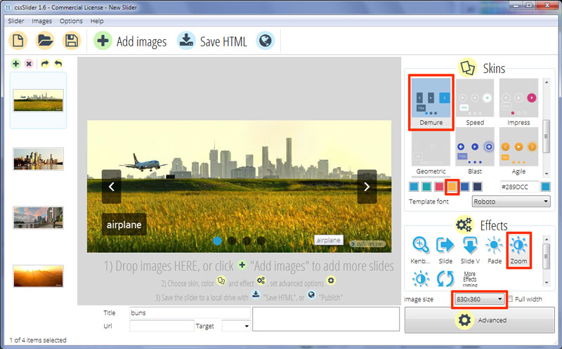
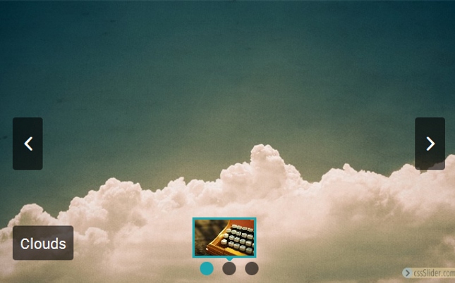
There is no frame or border around the slides, which allows the images to have maximum impact. Hovering the slide brings up two arrows, each allowing the user to navigate through the slides. The arrows are white arrow heads on a black semi-transparent rectangle with rounded corners. This rectangle is vertically orientated. The arrow flips in like it hinged on one side and then opens like a small door. There is a subtle bounce when it finishes 'opening', which helps it feel almost tangible.
Hovering over the arrow stretches the vertical rectangle into a square, that directly touches the edge. The square turns orange, the arrow moves outwards slightly in order to remain at the center of the square. The whole effect is stylish and unique.
Cycle through the images by clicking on the arrows.
The slider has a caption in the bottom left corner, comprised of a main title and a smaller ubtitle. The main title uses white text on a black rectangle with slightly rounded corners. The rectangle is semi-transparent. The sub-title is white text on an orange rectangle with slightly rounded corners. They both flip into place, in a similar fashion to the navigation arrow. They are both hinged along the top axis, but both appear at slightly different times, creating a 'cascade' effect.
The text then slides in from the side - the left on the main title and the right on the sub-title. Again, the whole thing is eye-catching.
The font used is Roboto, a stylish sans-serif font with geometric forms that retains a natural feel.
There are a series of black semi-transparent circles at the center bottom of the slideshow. Each one represents one of the images. The circle that is linked to the image on display turns orange and becomes opaque.
Hovering over a circle brings up a small preview image in an orange frame, and with a small orange arrow at the bottom pointing to the circle. This preview image is hinged from the bottom and flips into place. This effect replicates the look-n-feel of the nav arrows and captions.
The user can go directly to the image they really want to see by clicking on the appropriate circle.
The change effect on this demo is 'zoom', which zooms and fades out the current image and zooms and fades in the next image. It works well with the stylish look, and replicates the use of semi-transparency which helps give the modern design a lot of depth and sophistication.
The design only uses CSS, which means it can be used on platforms with javascript disabled, mobile website builder, and also makes it quick to load and responsive.
