100 % Pure CSS Slider?
Make perfect image sliders entirely in CSS. No JavaScript, no jQuery, no picture icons, no hand programming! It's truly fast, light, liquid, and retina-ready. Runs on each modern devices and web browsers. KenBurns, Slide, Fade, Zoom effects and a few flat themes are accessible. Download a free slider generator for Windows and Mac now!
Cross-browser
Works on each todays mobile devices and browsers, including early IEs (with the optional js fallback)
CSS3 animations
Sleek and smooth hardware-accelerated animations run far better than jQuery ones, specifically on smartphones and tablets
Retina-prepared
The slider bullets, play/pause, prev/next and other controls are vector font, making them monitor size independent and great for retina high-res screens.
Lovely templates
Pick themes, colors and effects in the astounding range that's contained and ready to go.
Any colors
CSS Slider does not wear images for styling so the skin color could be freely switched
Pure CSS
cssSlider is exclusively CSS powered (no jQuery, no JavaScript), hence it's going to run in any browser, without the need for any extra script libraries.
Highly Adjustable
Run css Slider web builder in two distinct settings styles: Basic and Advanced. Pick from several built in layout styles to keep things real simple, or dive into edit the settings in any manner you had like for full control.
Perfect CSS Slider
Just forget about any JavaScript - this photo slider is created with CSS and HTML exclusively
Light-weight and compatible
Turbo page performance is a certainty due to it is not getting slowed down by Java Script, together with being designed to the most current techie specifications to allow it to be extremely-compatible.
Adaptive slider
Liquid slider suits nicely to your website, in spite of the screen size
Extra Features
There is a great deal of configurations that you may tweak, such as beautiful transition transitions and colorful flat themes, prev/next navigation, bullets with thumbnails, auto-play, pause/stop, full width, full screen and other options.
Retina-ready
All slider controls are vector icon font and they're perfect on high-res monitors and screens
KenBurns Animation & Sheer Style Html Slideshow
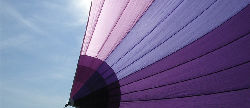
This slideshow has a soft, friendly almost romantic feel. It uses purple and white, and the use of semi-transparency reinforces the soft, dreamy look. This slider design would be great for dating websites, travel companies that specialize in romantic get-aways, and romance or chick-lit authors.
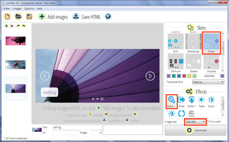
This example uses the 'kenburns' change effect to switch from one image to the next. This is a very gentle move-and-fade transition, that works well with the dreamy feel whilst also creating a sense of movement.
The caption in the bottom left corner uses purple text. There is a main title, against a very slightly transparent white rectangle with rounded corners and sub-title, which is against a semi-transparent white rectangle with a more opaque white border. The use of transparency throughout this design allows the colors of the photographs to come through in a soft, diffuse way.
The font used is Raleway, an elegant sans-serif typeface that works well with the color scheme.
The captions appear by seeming to swell into place from a single dot. The title appears first, followed by the sub-title.
Hovering over causes two navigation arrows to appear. These shrink into view. They have quite a unique design, being a transparent arrow-head with a semi-transparent white border against a transparent circle with a semi-transparent white border. Hovering over the arrow turns the circle purple and makes the arrow-head opaque.
Clicking on the navigational arrows allows you to cycle through the images in the slideshow.
Moving off the slider causes the arrows to expand in size and fade away. Again, this transition is lovely and smooth, and really reinforces the soft and romantic feel due to the fact it is reminiscent of rain drops falling into water.
There are small bottom semi-transparent white circles. They represent images within the slideshow, and the user can click on them to navigate to different images without having to wait for the whole sequence.
The circle that represents the current image in the slideshow turns transparent and gains a white border.
This carousel is CSS-only, so all the transition effects, icons and navigation is achieved without JQuery or Javascript. Also it is completely responsive, and on a small screen such as a smart phone the user interface simplifies - for example, the captions do not appear, and the navigation arrows are larger and easier to click on. On a mid-sized screen, such as a tablet, the slider becomes full-width.
Overall, this is a lovely slider design that is lightweight, responsive and perfect for website creator with a feminine look and feel.
