Live Demos
100% CSS Slider?
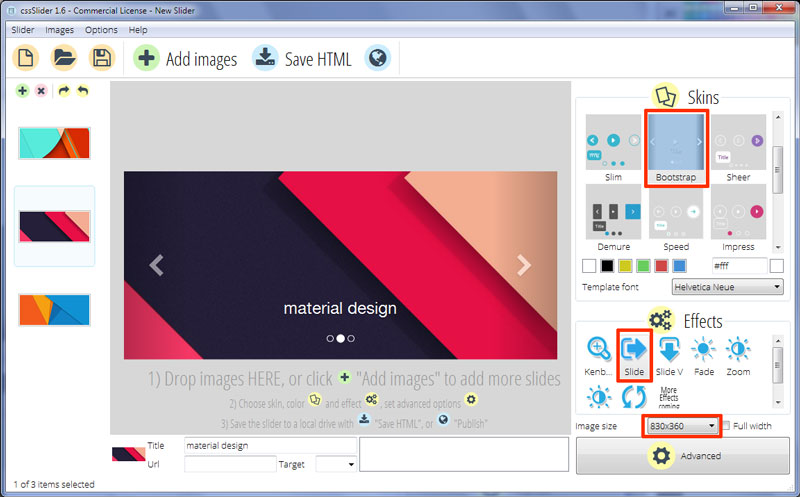
Develop beautiful image sliders fully in CSS. No jQuery, no JavaScript, no graphic icons, no programming! It's truly smooth, light, liquid, and retina-ready. Works on each current devices and browsers. KenBurns, Slide, Fade, Zoom transitions and some templates are accessible. Get a slider maker for Windows and Mac now!
100 % Pure CSS
cssSlider is strictly CSS powered (zero jQuery, zero JavaScript), so it's going to play in any browser, without the need for any extra script libraries.
Additional Options
That is a great amount of settings that you may tweak, such as perfect transition transitions and brilliant flat themes, prev/next navigation, bullets with thumbnails, auto play, pause/stop, full width, full screen and additional options.
SEO Friendly
cssSlider is crafted with plain HTML5. It looks fantastic and search engines are still able to crawl it efficiently. This enables you to keep your visitors and search engines both thankful all at one time!
Absolute CSS Slider
Just forget about using any JavaScript - this picture slider is made with CSS and HTML exclusively
Straightforward to Use
User-friendly, you just assign different templates, colors and transitions from the collection to your own slider. There's absolutely no knowledge of programming required at all. You may not need to type a single-line of code!
Liquid Design
People don't always visit your blog from the comforts of their home office desktop computer. Many use mobile phones, tablets, notebooks, or one of many other countless devices out there. This powerful, adaptive slider will perfectly scale itself to fit any monitor dimensions, guaranteeing your site will appear amazing on any device!
Retina-ready
All slider controls are vector font and they're excellent on hi-res displays
Drag and Drop
With the drag-n-drop, cssSlider couldn't be simpler to use. Drop and remove pictures, change the ordering, embed sliders in a few clicks.
Mobile-ready
cssSlider is completely compatible with any and all mobiles and will play just as well on your iPhone, iPad, Android as it does on your home desktop computer.
Lightweight and compatible
Turbo page speed is a certainty due to it is not getting slowed down by JavaScript, together with being developed to the most current technological guidelines to allow it to be ultra-compatible.
Responsive slider
Responsive slider fits nicely to your page, despite of the screen proportions
Slide Transition & Bootstrap Layout Bootstrap Slider
This CSS-only slider has a great design with more emphasis on the caption than many sliders. As such, it makes it useful for websites that need to use their carousels to display information as well as images.

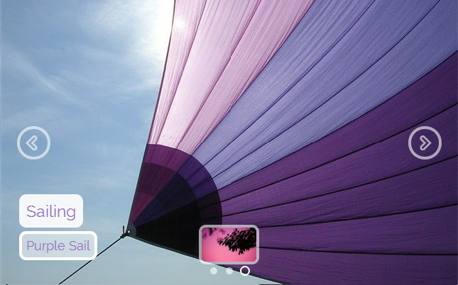
Two navigational arrows either side, appear all the time, a caption in the center bottom that includes a title and a paragraph of text, and a set of navigational circles at the bottom that allows the user to choose which slide they want to view.
The demo has an interesting 'shadow' effect down the left and right side. This helps the navigational elements, particularly the arrows, to stand out, and reduces the importance of the images. This bootstrap gallery is great for text against an interesting background image, and is not intended for sites that want to focus only on the images.
The navigational arrows are semi-transparent white arrow-heads with a subtle drop-shadow effect that gives them depth. When you hover over the arrows, the 'shadow' on that side darkens, and the arrow head becomes more opaque and thus brighter. Clicking on the arrows cycles through the images in the carousel.
The caption has white text that uses Helvetica Neue, perhaps one of the most recognizable and classic sans-serif fonts. It is a timeless font that can be used in almost any setting.
The text has a slight drop-shadow that helps it stand out from the background image and gives the caption some depth. Because the text appears directly on the image, you will want to ensure your text color and your background images have a high-contrast so that the caption is legible.
The navigational bullets are at the bottom center, each represent an image/caption in the slideshow. They are transparent, with a thin white border. A highlighted circle is opaque white with no border. Hovering over a circle brings up a preview image, in a white border.
The slider is built on a bootstrap builder framework, that makes it extremely easy to customize to meet your needs.
Because the slider is CSS-only, it works in browsers that don't have JQuery or Javascript enabled. It also makes the slider extremely fast to load, as there is no bloated javascript code or images to download. As such, it is a great slider design for mobile-first developers looking for a simple, responsive slider for the modern web.
Since this sample is developed using HTML5 and CSS it is search engine friendly, which is useful for a slider with an emphasis on text. All the captions in your slideshow will have SEO value.


