Perfect CSS3 Slider?
Make spectacular photo sliders fully in CSS. No jQuery, no JavaScript, no graphic icons, no scripting! It's amazingly fast, light, adaptive, and retina-ready. Works fine on each current devices and internet browsers. Fade, Slide, Zoom, Ken Burns transitions and a few flat themes are available. Download a slider creator for Windows and Mac now!
Retina-prepared
All slider controls are vector font and they are perfect on high resolution monitors and screens
Adaptive Layout
Customers do not always visit your blog from the comforts of their home office desktop. Many use mobile phones, tablets, notebooks, or one of many other countless devices available. This powerful, responsive slider will perfectly scale itself to suit all display dimensions, ensuring your website will look terrific on any device!
Liquid slider
Responsive slider fits wonderfully to your page, regardless of the display size
CSS3 transitions
Silky smooth hardware-accelerated transitions work far better than jQuery ones, specifically on mobiles
Automatic Cropping and Sizing
No need for separate picture editing tools. The cssSlider automatically crops your graphics and resizes them to fit whatever size you define!
SEO Friendly
cssSlider is developed with plain HTML5. It looks fantastic and search engines are still able to spider it easily. This allows you to keep your readers and search engines both pleased at one time!
Drag and Drop
With the drag-n-drop, cssSlider couldn't be easier to use. Include and remove pictures, alter the order, insert sliders in a few clicks.
Mobile-optimized
cssSlider is completely compatible with any and all mobile devices and will run just as well on your Android, iPhone, iPad as it does on your home desktop computer.
Eye-catching designs
Choose themes, colors and effects in the impressive group that is comprised and prepared to go.
Highly Adjustable
Run css Slider webpage builder in two distinct configuration styles: Basic and Advanced. Select from several integrated layout looks to keep things real simple, or dive into edit the settings in any manner you had like for in depth control.
Rotate Animation & Blast Theme Slideshow Html
This is a bright and fun slider theme for your website. The theme uses a cheerful yellow-orange color scheme that will help your slideshow really stand out. Modern ‘bouncing’ transitions add movement and life and draw the eye.
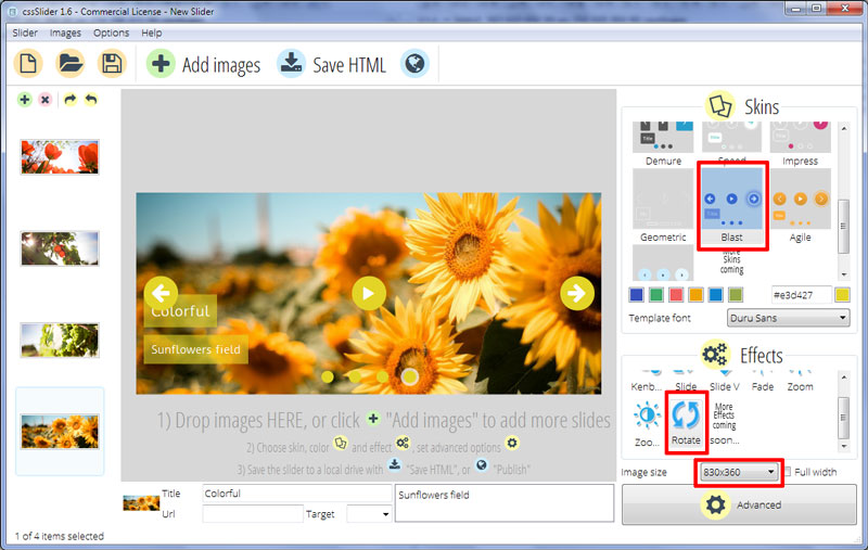
This CSS-only slider template has a number of elements to help the user navigate through the slides. At the bottom-center of the slider is a series of bullets. These can be used to skip between slides. Each circle represents one of the images in the slideshow. This is communicated to the user by highlighting the relevant circle as each new image appears. The circles are yellow-orange, and are highlighted by gaining a semi-transparent light-grey border.
You can hover over a circle and a preview image appears within a semi-transparent orange frame, letting the user decide which images they are most interested in viewing.
Hovering over the slideshow causes the rest of the navigation interface to appear. These icons fade-and-shrink into place, a unique and interesting effect that fits well with the ‘fun’ feeling of the theme. When the user stops hovering over the slider, the icons expand as they fade out.
There are three icons. A ‘previous’ arrow on the left, a ‘pause’ button in the center, and a ‘next’ arrow on the right. They all have standard icons so are easy to use. Interacting with one of the icons causes a ‘halo’ effect, where a yellow circle explodes out from it and fades away. Again, it is unique and fun and makes this slider a pleasure to use.
More information can be added to each slide in the text-area in the lower-left corner. These comprise of two semi-transparent yellow rectangles with white text. The theme uses the font ‘Duru Sans’, which is quite a classic sans-serif font that is extremely easy to read and has a modern feel.
The text-boxes drop into place slightly asynchronously which reinforces the quirky, fun feel of the slider design.
This theme uses the change effect ‘rotate’ to transition from one image to the next. This is a fun effect that is full of movement. Each image ‘spins’ out and away, while the next image spins in and down.
All of the animation effects — for the icons, caption and main images — use a similar style, whilst each being individual. This contributes to the quirky and modern look and feel of the design.
The slider is responsive, scaling up and down to fit the screen display. Because it uses only CSS3, and no images, it is fast to load even on smartphones and tablets.
Because of the bright colors and fun style, this slider would be great for websites aimed at children, or for any html website builder that wants a bright and clean look. Some restaurants, tourist attractions and any outdoor pursuit sites would also benefit from the fun, open-air feel.


