Perfect CSS3 Slideshow?
Get perfect image sliders totally in CSS. No JavaScript, no jQuery, no picture icons, no coding! It's truly fast, light, liquid, and retina-ready. Works perfectly on every todays devices and web browsers. Fade, Slide, Zoom, Ken Burns animations and a number of flat skins are accessible. Get a slider creator for Windows and Mac now!
CSS3 animations
Silky smooth hardware-accelerated animations run much better than jQuery ones, especially on mobiles
SEO Friendly
cssSlider is made with plain HTML5. It looks amazing and search engines are still able to crawl it successfully. This will let you keep your viewers and search engines each happier at the same time!
Cross-browser
Works well on each popular mobiles and internet browsers, including early IEs (with the optional js fallback)
Any colors
CSS Slider does not use images for styling therefore the skin color could be freely changed
100 % Pure CSS Slider
Stop using any JavaScript - this image slider is created with CSS and HTML at 100%
Adaptive slider
Adaptive slider suits properly to your webpage, regardless of the screen size
Highly Customizable
Run css Slider website builder in two distinct settings styles: Basic and Advanced. Select from several integrated layout looks to keep things real simple, or dive in to edit the settings any way you'd enjoy for complete control.
No-jQuery Slider
You can forget overweight and slow-moving jQuery containing a great deal of unused code
Amazing designs
Select designs, colors and effects in the astounding library that's included and prepared to go.
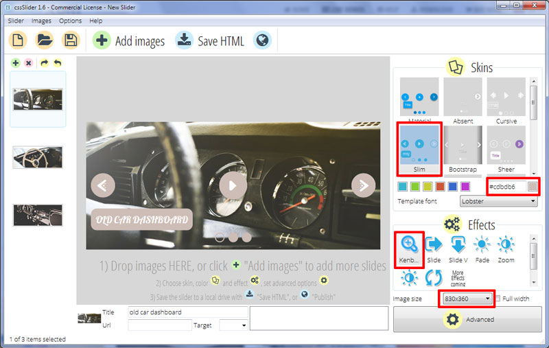
Kenburns Effect & Slim Skin Html5 Slider
If you want an elegant slider design with an old-fashioned sophistication then this is the one for you.

The design uses a soft and faded brown, reminiscent of sun-bleached leather, and white. By using only two colors, the design manages to remain simple and elegant but additional flourishes in the typography and UI elements stop it from feeling too stark and clean.
The first thing to notice is the text in the lower-left corner. This is comprised of a faded brown rectangle with rounded corners and an eye-catching font. This font is Lobster, an incredibly detailed script type that uses hundreds of ligatures and alternate letter forms to mimic handwritten text. The result is a caption with vintage elegance, perfect for an antiques site or any website with a historical or nostalgic slant.
The caption slides in along a vertical line. It is not an ostentatious effect, but serves to draw the eye and add some movement to the design.
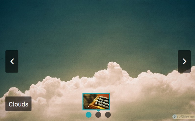
Along the bottom of the slider are a series of solid brown circles. These are used to navigate between slides. A highlighted circle turns transparent with a brown border. Interacting with a circle causes a preview image to fade into view and clicking on the circle loads that image into the slideshow.
This ‘bullet navigation’ is not the only way to control the slideshow however. If you mouse-over the slider, you will bring up three icons. These are brown circles with white icons; one on the left, one in the center and one on the right. The icons on the left and right are previous/next slide arrows, and they use a stylish and unusual icon that comprises of a white arrowhead and three dots to add a vintage flourish. The icon in the center is a play/pause button.
Hovering over one of the icons causes it to turn transparent with a brown border — mimicking the highlighted circles from the bullet navigation and creating a consistent look and feel throughout the design.
The slider uses the ‘Kenburns’ change effect. This is a lovely effect that means the image is in constant motion, slowly fading into the next. It creates a seamless transition that is gentle and hypnotic.
Although this design has an old-fashioned look and feel there is nothing old-fashioned about the technology behind it. The slider uses CSS3 and HTML5 to create the iconography and animation, a modern approach that allows the slider to load blisteringly fast, without reliance on Javascript or JQuery. As you would expect, the slider is completely responsive, working equally well on a smartphone or a widescreen TV.
In short, this design is an ideal choice for many different websites. It would work particularly well for antiques dealers, anybody dealing in vintage goods, and clothes designers that channel an old-fashioned elegance and sophistication. It would also work well for historical romance authors.


