There are many things you can customize about your slideshow, from the style of the buttons to the color scheme to the way the images transition.
To start with, cssSlider comes with a wide range of skins to use with your slider, and allows you to edit the color scheme to exactly match your websites. You can edit the appearance of your slider in the following ways.
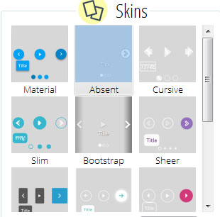
1. How to change the skin of your slider
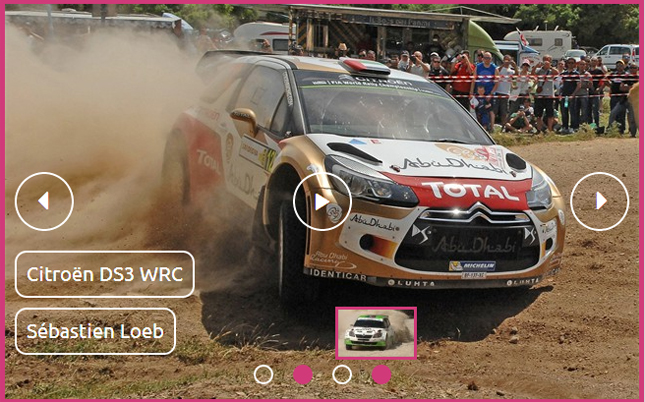
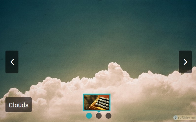
In the right hand panel, there is a section called 'Skins'. In here, you will find a large number of different templates to use on your slider. These skins change the appearance of different areas of the slider, for example the pause/play button, the navigational arrows, and the caption. Some are minimalist and clean, others are fun and playful, others are stylish and bold. New skins are being added all the time.
You can scroll through this section to preview the skins.
Click on the skin you want to try out. You will be able to preview how the skin looks on your slider in the preview section of the main window. You can experiment with different skins to see which one looks the best for your slider.
2. How to change the color scheme of your slider
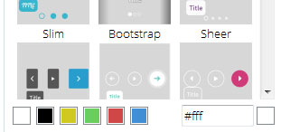
Every skin is CSS only, with no images involved. This means changing the color scheme is extremely easy. The color scheme applies to navigational buttons, captions, and the bullet navigation strip.
To change the color scheme, look below the selection of skins in the right-hand window. You will see a series of square boxes containing different colors, and a html hex code input box with a color picker. You can either choose one of the preloaded colors by clicking on a colored box, or you can input the exact hex code if you know it.
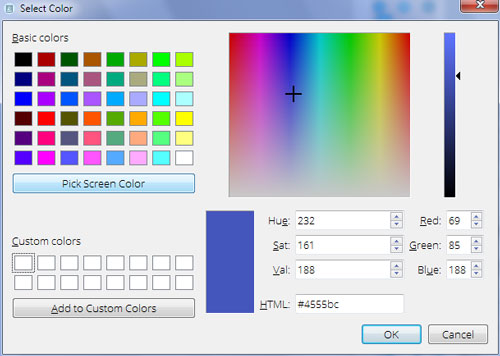
If you don't know the hex code, but you want more colors than are available in the preloaded squares, you can click on the colored square next to the hex code input box. This opens a 'color picker' screen.
There are several ways to choose a color from this screen. You can use the straightforward color picker tool, which allows you to select any color. You can also use the 'pick screen color' button, which allows you to select a color from one of your slides in the left hand panel to match it. This can be useful if your images have similar colors.
There are also input boxes for you to add the RGB values of a custom color, the Hue, Saturation and Value values or the HTML hex code. These options should cover any colors you use for your brand. Altogether, there are a number of ways for you to find exactly the right color for your slider.
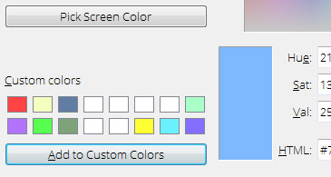
3. Save your custom colors
Once you've found the right color for your slider, you can save it as a custom color. This allows you to find those same colors quickly for any new sliders you create. If your website has a specific color scheme, you can save those as custom colors and apply them to all sliders you create for that website. Or if you have brand colors that you use across multiple websites, you can save those as custom colors and again re-use them quickly for additional sliders you create.
You can save up to sixteen custom colors.
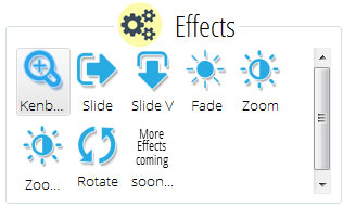
4. How to change the transition effect
The transition effect is the effect applied when one image in the slideshow is replaced with a different image. There are a number of different transition effects for you to choose from, and more being added all the time.
To change the transition effect, look below the color bar in the right hand navigation panel to the section called 'Effects'.
You will see a variety of buttons, with titles such as 'Kenburns' and 'Fade'. Click on one of the buttons, and a new effect will be applied to the slider in the preview screen. Try different transition effects until you find the best effect for your slider.
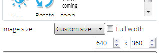
5. How to change the image size
Below the transition effects section of the right hand panel in cssSlider is a drop down box called 'image size'. This allows you to set the overall maximum dimensions of the image slider. The preset sizes range from a large 1024x768 pixels to a small 320x240 pixels. You can also add your own custom size. When you click on the 'custom size' option in the drop-down menu, two new input boxes will appear for the width and height. Enter the relevant values in pixels.
This drop down box changes the maximum dimension of the slider and the overall ratio (how square or widescreen it is). This allows you to create sliders that can be used in a variety of spaces -- such as in sidebars, footers, headers or full-screen.
Because the slider is fully responsive, if the available screen space is less than the maximum dimensions, it will seamlessly resize itself to fit the space. This means you can create a large, full-screen slider and know that it will look just as good on a smart phone or tablet.