Perfect CSS3 Carousel?
Develop eye-catching image sliders entirely in CSS. No JavaScript, no jQuery, no picture icons, no programming! It's really smooth, lightweight, responsive, and retina-ready. Runs fine on all modern devices and internet browsers. KenBurns, Slide, Fade, Zoom transitions and a bunch of designs are included. Get a free slider builder for Windows and Mac now!
Retina-prepared
The slider prev/next arrows, bullets, play/pause and other controls are vector font, making them monitor size independent and ideal for retina hi-res displays.
Outstanding animations
cssSlider includes incredible pure CSS3, hardware-accelerated transitions to excite your visitors and help keep their eyes focused on your web page.
Drag and Drop
With the drag-n-drop, cssSlider could not be more convenient to use. Drop and delete pictures, change the order, insert sliders in seconds.
Additional Settings
That is a great amount of settings that you may tweak, such as beautiful transition effects and vibrant flat skins, prev/next navigation, bullets with thumbnails, auto play, pause/stop, full width, full screen and other options.
No-jQuery Slider
No weighty and slow jQuery including a great deal of unused code
SEO Friendly
cssSlider is crafted with plain HTML5. It looks excellent and search engines are still able to spider it effectively. This lets you keep your viewers and search engines each satisfied all at one time!
Zero coding
Create your slider in minutes with the visual creator
Mobile-optimized
cssSlider is totally compatible with any smartphones, tablets and will run just as well on your Android, iPhone, iPad as it does on your home computer.
100% CSS Slider
Just forget about using any JavaScript - this photo slider is created with CSS and HTML at 100%
Liquid Layout
Customers do not always browse your site from the comforts of their home office desktop computer. Many use mobile phones, tablets, laptops, or various other countless devices available. This powerful, liquid slider will wonderfully scale itself to fit all screen dimensions, guaranteeing your site will appear awesome on any mobile!
Extremely Adjustable
Run css Slider website builder in two different configuration modes: Basic and Advanced. Select from a number of built-in layout styles to keep things real simple, or dive in to edit the configuration in any manner you'd prefer for in depth control.
Slide Animation & Bootstrap Skin Css Slideshow
This slider has a very no nonsense feel to it. Instead of a border that restricts the picture, a borderless template is used which gives more emphasis on the picture as well as provides a cutting edge look to whatever image the slider holds. The lack of boundary also allow this slider to be perfect for any website as it has the capability to blend in with whatever theme the website has and improve upon it with its classy design.
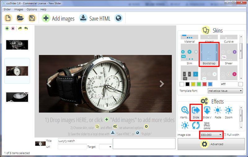
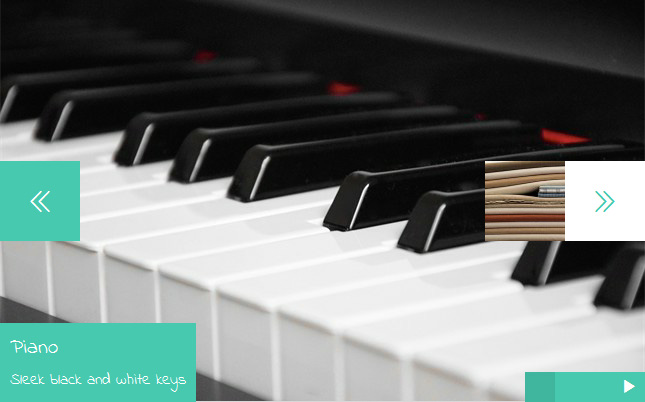
For ease of users who might otherwise be unaware that there are other pictures available, this slider has direction arrows always visible. These arrows can be used to switch between pictures and although they are visible even when the mouse is not hovered over the image, they darken and increase in visibility when the cursor is over them.
The traditional navigation dots are used in this slider and are always visible. So instead of shuffling around with the arrows, you can use the slider to jump to images that aren’t immediately together. When hovered upon, the navigation dots reveal the picture that has been assigned to them so that the website visitors can get a preview of the image before they click upon it.
Labelling of the images is done in a classy way as well and the writing appears just above the navigation dots right in the horizontal centre of the image. A medium font is used which makes the writing eligible but not overwhelming hence going with the chic overall look of the slider.
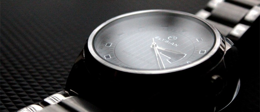
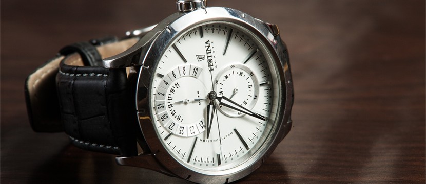
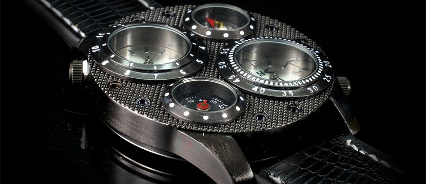
The finesse of this slider makes it ideal for luxury websites and fashion-isque projects. The edge look delivers a modern feel and the wide set image holder gives a lot of room for the promotion of anything. As the demo suggests, watches and fine accessories would gain a lot from this slider and I would darker set websites better. A number of transition effects can be used with this slider to help it adapt to any drag and drop website builder that incorporates it.
