Pure CSS3 Slider?
Build stunning image sliders entirely in CSS. Zero jQuery, zero JavaScript, no picture icons, no hand scripting! It's really smooth, lightweight, responsive, and retina-ready. Works on every current devices and web browsers. Fade, Slide, Zoom, Ken Burns effects and a number of skins are accessible. Get a free slider maker for Windows and Mac now!
Striking transitions
cssSlider has amazing pure CSS3, hardware-accelerated animations to excite your customers and help to keep their eyes concentrated on your own site.
Gorgeous templates
Select designs, colors and transitions from your astonishing gallery that's built in and prepared to go.
Extra Settings
There's a large amount of settings that you can tweak, including perfect transition effects and brilliant flat designs, prev/next navigation, bullets with thumbnails, auto play, pause/stop, full width, full screen and additional options.
Simplified to Use
Easy to use, you just assign different skins, colors and transitions from the collection to your own slider. There's zero understanding of programming necessary in any way. You may not need to write a line of code!
Instant Preview
Instantly preview your slider and all modifications which you make in the preview window. Be Sure everything is just how you need it ahead you publish!
Any kind of colors
CSS Slider doesn't need images for styling hence the template color could be freely changed
100 % Pure CSS
cssSlider is purely CSS powered (no jQuery, no JavaScript), so it's going to play in any browser, without the need for any additional script libraries.
Light-weight and compatible
Lightning page speed is a certainty since it's not getting slowed down by Java Script, as well as being designed to the most up-to-day techie guidelines to allow it to be extremely-compatible.
Absolutely no coding
Prepare your slider in seconds with the visual maker
Adaptive Design
People do not always explore your site from the comforts of their home office desktop computer. Many use smartphones, tablets, notebooks, or various other numerous devices out there. This powerful, liquid slider will perfectly scale itself to suit all screen dimensions, ensuring your site can look terrific on any mobile!
CSS3 transitions
Silky smooth hardware-accelerated animations work much better than jQuery ones, especially on mobile devices
Drag and Drop
With the drag-n-drop, cssSlider could not be more convenient to use. Drop and remove pictures, alter the ordering, embed sliders in a few seconds.
Zoom Transition & Basic Template Wordpress Slider
This attractive and feminine slider template uses pink and grey to great effect.
The slider itself is relatively ‘square’ in shape, unlike many sliders which require you to only use images that are panoramic landscapes. As such, it is a very flexible design that could be incorporated into a wide range of website themes.
Each image in the slideshow has space for a caption in the lower-left corner. The title is grey text on a rose-pink rectangle with rounded corners, and the sub-title has dark grey text on a pale-pink rectangle with rounded corners. The main title bounces down from above and the sub-title bounces up from the bottom. The top rectangle overlaps the bottom. As the two rectangles move into place they cause the text to ‘rebound’, a pleasant effect that makes the design feel extremely modern.
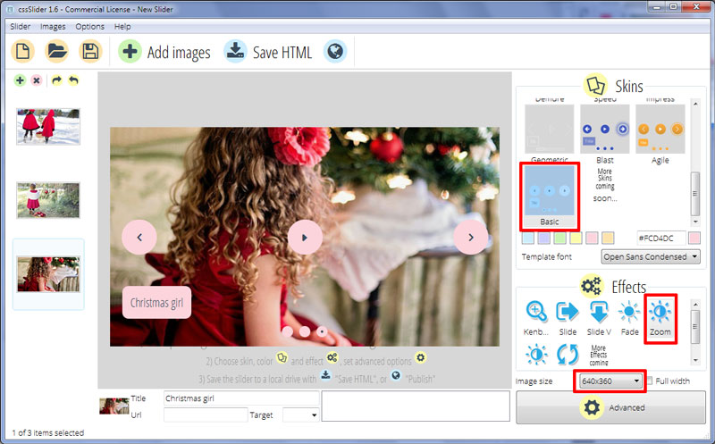
The font used in the caption is ‘Open Sans Condensed’. This is a modern sans-serif font that has a friendly appearance and is extremely easy to read at small font sizes.
The images in the slideshow use a ‘zoom’ change effect. This is the effect that is applied when one images transitions to the next. The new image zooms and fades in, while the previous image zooms and fades out.
The user can navigate through the images in the slideshow by using the navigational arrows that appear when they hover over the slider. These arrows are grey arrowheads on a rose-pink circle that drop slowly into place. Hovering over one of the navigational arrows causes the circle to fade to pale pink, and for the arrowhead to vibrate gently, which encourages the user to click on it.
Clicking on the arrows allows the user to cycle through the images.
There is also a pause button that appears with the navigational arrows. This allows the user to pause and play the slideshow. The icon has the same look and hover effect as the navigational arrows.
The user can also navigate through the slides by using the circles in the bottom-center of the slideshow. These are rose-pink circles that, when highlighted, have a small grey dot in the center. The user can hover over the circle to bring up a preview frame, or click on a circle to load that frame into the slideshow. This allows the user to skip directly to the image they are most interested in.
As with every cssSlider theme, the design is completely responsive and works on every screen size. A great deal of thought has been given to the responsive design, meaning that the caption text disappears when on a small screen to give more space for the images.
There is a lot to like about this slider design. There are small details, such as the way the caption text uses overlapping, that give this design a polished appearance without detracting from the soft and feminine style. This slider would be perfect to use on blogs, websites aimed at a female audience, or arts-and-crafts websites.

