Absolute CSS3 Slider?
Get beautiful image sliders entirely in CSS. No JavaScript, no jQuery, no graphic icons, no scripting! It's really fast, lightweight, liquid, and retina-ready. Works fine on each popular devices and web browsers. KenBurns, Slide, Fade, Zoom effects and a few designs are included. Get a free slider maker for Windows and Mac now!
Cross-browser
Works fine on every modern smartphones, tablets and internet browsers, including old IEs (with the optional js fallback)
Retina-prepared
The slider prev/next arrows, bullets, play/pause and other controls are vector font, making them monitor size independent and perfect for retina high-res screens.
SEO Friendly
cssSlider is made with clear HTML5. It looks brilliant and search engines are still able to crawl it perfectly. This enables you to keep your viewers and search engines both thankful all at one time!
Drag and Drop
With the drag-n-drop, cssSlider could not be simpler to use. Add and remove images and videos, change the order, embed sliders in a few clicks.
No-jQuery Slider
Forget about large and slow-moving jQuery containing a great deal of unused code
Simplified to Use
User-friendly, you only assign various skins, colors and effects from the collection to your own slider. There is zero understanding of programming required at all. You will not have to type a single-line of code!
Lightweight and compatible
Turbo page speed is a certainty because it's not becoming slowed down by Java Script, as well as being designed to the most current technological specifications to allow it to be extremely-compatible.
Retina-ready
All slider controls are vector icon font and they're great on high-res monitors and screens
Color Combinations
Every cssSlider design goes with 6 pre-made color design to make your selection easier.
Any colors
CSS Slider doesn't use images for styling hence the template color could be effortlessly modified
Liquid slider
Adaptive slider fits nicely to your page, regardless of the screen dimension
KenBurns Transition & Material Style Jquery Gallery
This theme for cssSlider is an attractive design, with a slightly retro feel, that is ideal for websites focused on IT software or hardware. It uses two shades of blue and two shades of grey. This color scheme attracts the eye and makes the slideshow stand out from any website. The use of drop-shadows updates the otherwise retro design aesthetic.
The carousel does not have a border or frame. There is a faint drop-shadow around the image, that helps lift it off the page. When you hover over the image, this drop-shadow expands and becomes softer. This is a beautiful and extremely subtle attention to detail that many people will not notice, but really helps this design stand apart.
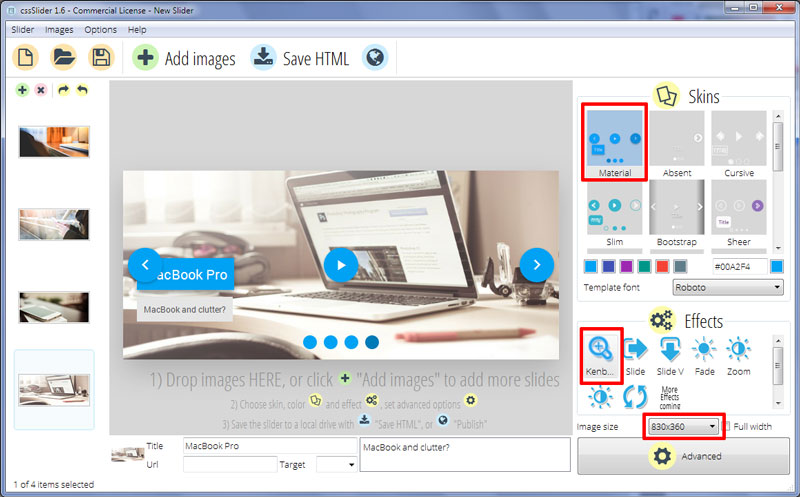
When you hover over the main image, three blue buttons appear. These are additional navigation elements, that allow the user to interact with the slideshow. Each one is a blue circle with a white icon. There are two arrows which allow the user to cycle through the images in the slider, and a pause button which allows the user to stop the slideshow from automatically playing.
Hovering over one of these icons causes it to go a slightly darker shade of blue, and for the drop-shadow to shift. Again, the overall effect is quite subtle and shows that the designer has paid a lot of attention to small details. The overall effect creates a tactile feel, and encourages the user to click on the icons and interact with the slideshow.
Each image in the slideshow has a caption in the lower-left corner. There is a title, which is white text on a blue rectangle, and a subtitle which is dark-grey text on a pale grey background. These rectangles ‘bounce’ into place from the top and bottom of the slideshow, the motion is smooth and the way the rectangles ‘bounce back’ slightly as they settle into place is another example of the attention to detail in this design.
There is also a series of circles in the bottom-center of the slideshow. This is the ‘bullet navigation’, and allows users to skip between different slides in the slideshow. Each of these circles is blue, that darkens to highlight the bullet that represents the current image in the slideshow. If the user hovers over a circle, they bring up a preview image of the slide in a thick grey frame with a drop-shadow. Clicking on the circle then loads that slide.
Each image in the slideshow slowly zooms and fades into the next. This transition effect is called ‘Kenburns’ and the continuous movement is eye-catching, and gives the slideshow a lot of life.
The design is responsive and quick loading, and the attention to detail really makes this theme something special.


