


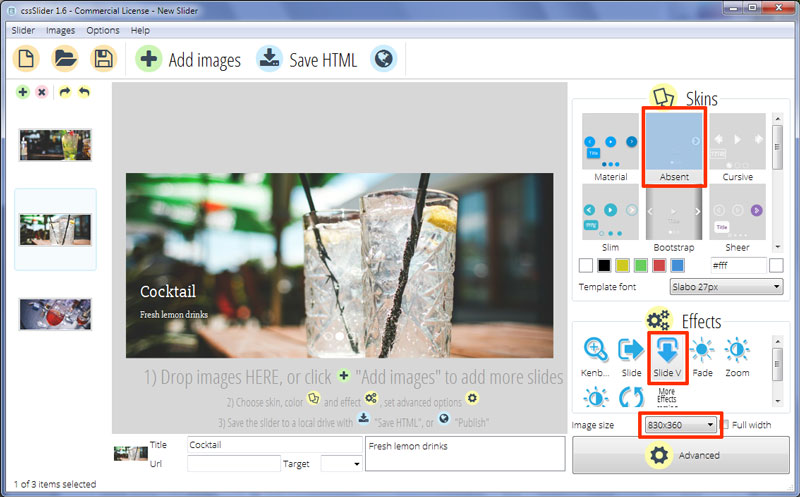
Slide Vertical Effect & Absent Theme Slider Jquery
The CSS Slider template ‘Absent’ is a minimalist and modern slider design. It uses a single color, white, and has clean lines with no extraneous detail. The use of drop-shadows adds a touch of elegance and stops the design from feeling too stark and cold.
The slider is responsive and resizes to fit the screen. On smaller screens, some of the interface disappears in order to allow the images to remain the focus of the design.
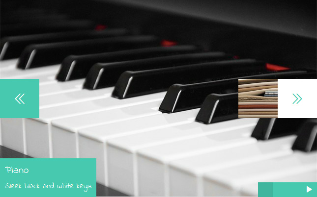
One of the unique aspects of this template is what happens when the user hovers over the slider. The mouse arrow changes into a button that moves with the mouse. Depending on where you hover your mouse, you have a ‘previous slide’ button, a ‘pause/play’ button, and a ‘next slide’ button. As you would expect, when you click your mouse button the appropriate action takes place — the slider pauses, or you can navigate through the slides at your own speed. This effect is achieved completely with css — there is no JQuery or Javascript involved. There is similar support for gestures on a touchscreen device such as a tablet or smartphone.
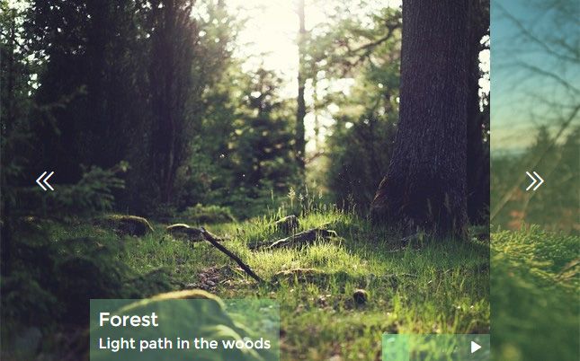
The buttons are white circles with transparent icons. There is a slight drop-shadow on the circles, which helps them stand out from the images.
There is a caption in the bottom left corner. Unlike the navigation buttons, this caption is always visible. There is a title and a subtitle. The font used is ‘Slabo 27px’, a modern serif font that gives the otherwise minimalist design a touch of sophistication.
The text is white, with a subtle drop-shadow.
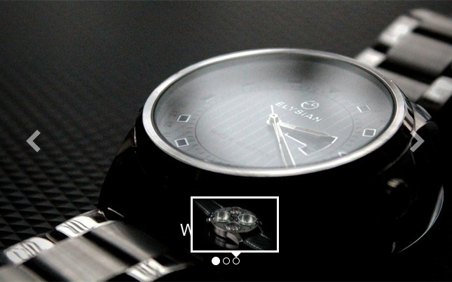
There is a series of bullets at the center-bottom of the slider. These bullets each represent a slide in the slideshow, and can be used to navigate between the images. Each bullet is a transparent circle with a white border and a slight drop shadow. Hovering over a bullet causes a preview image to appear in a white frame. Clicking on a bullet loads the appropriate slide into the slider.
The transition effect used is called ‘Slide Vertical’. Each image slides elegantly up from the bottom of the slider, starting quickly and slowing down as it settles into place. It’s a simple but effective transition. An additional touch is that, when the cycle of images finishes, the slider ‘runs back’ through each image very quickly to return to the start of the slideshow.
Overall this is a modern design with a touch of sophistication. It would be ideal for almost any e-commerce website, particularly those selling luxury items, computer software or hardware and other gadgets. It would also work well for a news website, as the design is simple and allows the content to appear front-and-center.