


Ken Burns Animation & Utter Template Jquery Carousel Slider
This slideshow template features large images that attract attention and give your website a real WOW factor!
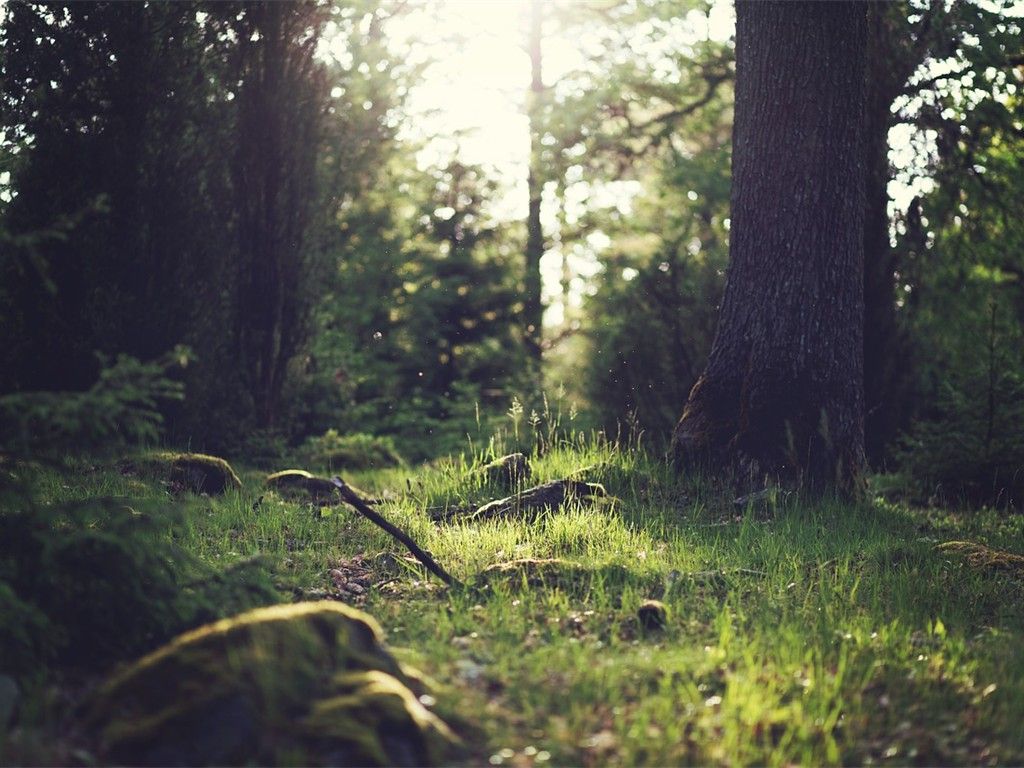
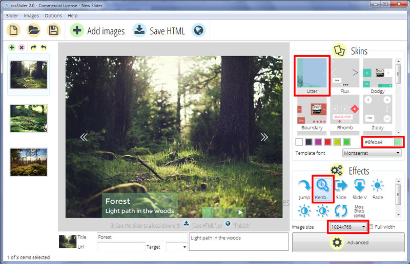
The color-scheme of this template is white and green, the combination of which is gentle and attractive. This template would be great for websites that want to showcase great images, such as travel sites, e-commerce sites, and portfolios. It also works well with scenes of nature, so would be good for environmental websites.
Because the template uses only HTML5 and CSS3, it is fast to load, and works with all modern browsers. It is also completely responsive, working equally well on a smartphone, tablet, laptop or desktop computer. It would even look fantastic on a TV or kiosk screen — making this template ideal for interpretation sites designed to be displayed in museums and galleries.
The images used are quite square in shape, making it a template better for sites with images that don’t fit into the more standard landscape layout.
The images are in constant motion, and fade seamlessly into one another. This attracts the eye and lends motion and interest to any website design.
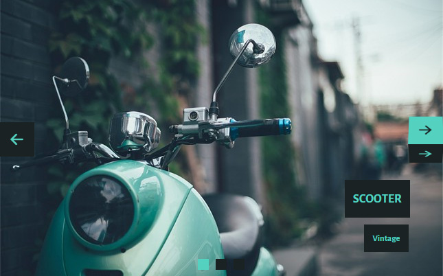
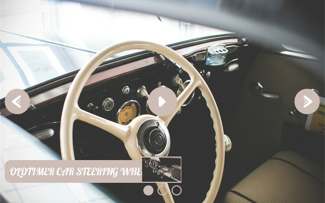
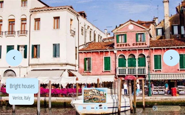
There are several navigation elements. On the left and right sides of the image is a double-arrow head. These arrow-heads function as next/previous arrows, and allow the user to cycle through the images in the slideshow at their own pace. When you hover over one of the arrowheads, a narrow column previews the image that is about to load. This is a unique hover affect, and one that will really make your website stand out.
At the bottom left corner of the slideshow template is a caption. This is nestled against the bottom edge of the image, and features white text on a translucent green rectangle. There is a title in larger letters and a subtitle in smaller letters underneath. Each caption slides into place from the left side of the slideshow, and disappears off to the left as well. This is a subtle but attractive transition effect.
The font used is Montserrat, which is a san-serif font that has a slight vintage feel.
In the bottom left corner is a navigation strip and a pause/play button. Pressing the pause button will ‘freeze’ the image and stop the constant motion and the fade in and out. Pressing play will re-start the slideshow.
The navigation strip consists of a series of translucent green squares, each one representing an image. The square that represents the current image in the slideshow is less-transparent green square. Hovering over each square brings up a small preview of the image in question, and clicking the square will load the image into the slideshow.
Overall, this is a beautiful and attractive slideshow theme, that will work brilliant with a wide range of websites. It is responsive, uses modern web-technology, and truly allows your images to create a real impact on the viewer.