


Slide Effect & Speed Style Responsive Slider
This slider has a simple but fun design that uses white and blue, a combination that feels neutral but friendly.
Because the design only uses CSS, it is incredibly quick to load. The design is responsive and able to be displayed on almost any platform, even ones with javascript disabled.
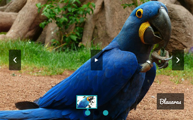
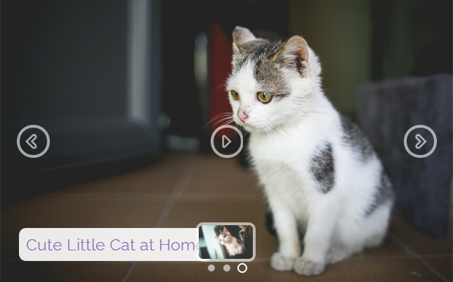
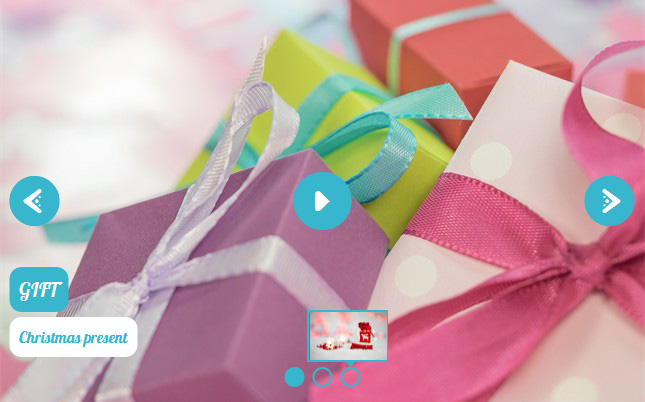
The slideshow does not have a rack, which allows the images to be the main focus. On mouseover it brings up two navigational arrows. They seem to spin into place from four small dots, a fun transition that is eye-catching. Moving off the slider area causes them to spin away, and collapse back into the four small dots, which then vanish. The navigational arrow is white, and has a slightly rounded feel which again helps reinforce the fun and friendly feel. It is contained within a transparent circle with a white border.
You can use the arrows to cycle through the images.
You can also navigate through the images by using the series of white circles towards the bottom of the slide. These circles have a transparent border and then a white border - which creates a 'double circle' appearance. Each circle represents an image slide. It turns blue, gains a white circle around it and then a semi-transparent white border around that, creating a triple-circle effect that is reminiscent of a dartboard or other target.
Hovering over a circle will bring up a preview image in a white frame, that also has a white arrow at the bottom pointing to the appropriate circle. This preview image zooms into place with a slight bounce, in the same way as the captions do.
Clicking on a circle navigates the user directly to the image they have the most interest in.
There is the ability to display a caption in the left corner at the bottom. This comprises of a title and a subtitle. The title is blue text on a white rectangle with rounded corners. The subtitle is white text on a rectangle with rounded corners, that has a white border. Both zoom into place, with a small bounce at the end of the zoom as they achieve the right size. Again it feels fun and friendly.
The font used is Hamersmith One, which has a quirky, almost naive handwritten look. It is a font that has been specifically designed for low contrast settings, and to be read on a screen, so it is extremely legible.
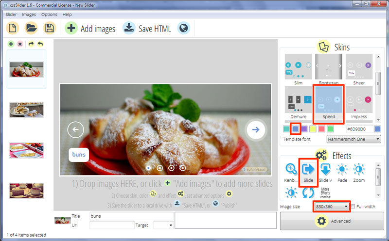
The change effect on this demo is 'slide', which slides each image into place from the right or left. The slide starts fast and then slows down, a subtle effect that makes the transition feel clean and modern. When it reaches the end of the sequence of images, it slides back to the beginning, showing all of the images and giving the impression the images are on a spool of film.
This design could be used for nearly any responsive website builder that needs a fresh look that still has a quirky, fun feel to it. It would be great for bloggers, authors and publishers, and family-friendly restaurants.