100% CSS3 Carousel?
Generate stunning picture sliders totally in CSS. No jQuery, no JavaScript, no picture icons, no coding! It's extremely smooth, lightweight, liquid, and retina-ready. Runs perfectly on every todays devices and internet browsers. Rotate, Pan & Zoom, KenBurns, Fade, Slide effects and some flat templates are accessible. Get a free slider builder for Windows and Mac now!
CSS3 effects
Silky smooth hardware-accelerated transitions perform much better than jQuery ones, especially on mobile devices
Fabulous designs
Choose skins, colors and transitions in the awesome gallery that's integrated and ready to go.
Striking animations
cssSlider has remarkable pure CSS3, hardware-accelerated transitions to excite your visitors and keep their attention concentrated on your own web page.
100 % Pure CSS Slider
Forget about any JavaScript - this image slider is created with CSS and HTML at 100%
No-jQuery Slider
No weighty and slow jQuery including loads of unused code
Absolutely no coding
Make your slider in a few clicks with the visual builder
Cross-browser
Runs perfectly on every modern smartphones, tablets and web browsers, including aged IEs (with the optional js fallback)
Zoom Animation & Geometric Layout Bootstrap Carousel
This slider makes use of square corners and geometric shapes to create a very modern, masculine design that has a lot of authority.
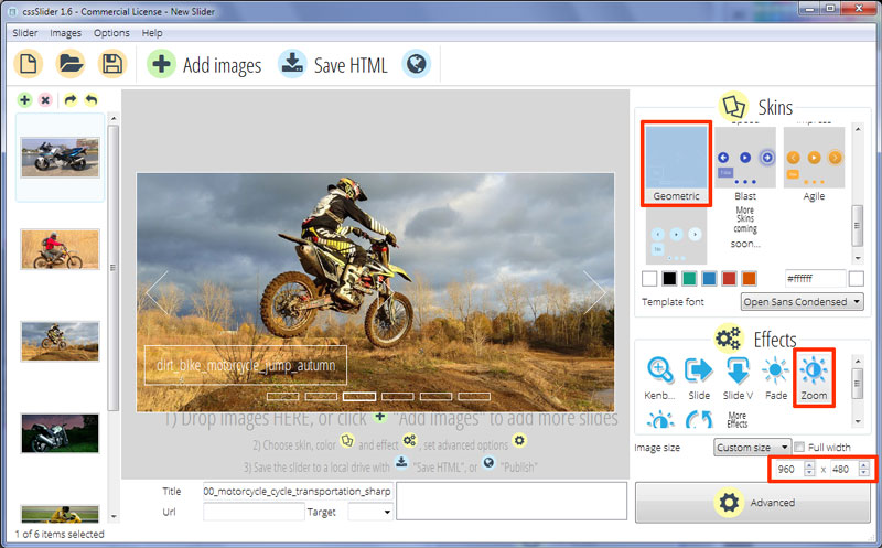
The slide show has a very thin white border that is just enough to help it stand out against the rest of the website. It would work well against a dark or black background.
The main slideshow itself uses a 'zoom' transition effect to move from one image to the next. This effect zooms out the first image and zooms in the next, combining the zoom with a fade. It has lots of movement and is eye-catching.
There is a caption in the bottom left corner. This caption uses the font 'Open Sans Condensed' which is sans-serif font with quite an authoritative feel to it.
The caption is white text on a transparent rectangle with a thin white border. There is a lot of space in the rectangle, which helps emphasize the sharp, squared off feel. There is both a title and a sub-title, and the title drops in from above, while the sub-title slides in from the right. Because they slide in from different directions and meet at a corner, it again helps reinforce that squared-off look and helps create a consistent feel across the whole design.
Hovering over the picture causes the navigation icons to appear. These are two thin white arrow-heads on each slide side. Each arrow-head is like a square turned on an angle and cut in half. These arrow-heads slide into place from the centre of the slideshow.
There is also a pause/play button that appears in the center, and this is just a white icon that rises into place.
Hovering over any of the icons causes them to move slightly, a subtle rollover effect that lets the user know they can interact with them.
There are a series of transparent rectangles with white borders at the bottom. Each rectangle represents an image in the slideshow. Hovering over a rectangle causes a small preview image to appear and clicking on a rectangle loads that image into the view area.
The rectangle linked to the current image has a thicker border for emphasis.
Because of the squared-off, authoritative design, this slider would be great for fitness sites that specialize in challenging work-outs, particularly strength-training. It would also be great for financial create mobile website that want to make a trustworthy impression.
