

Fade Animation & Demure Style Javascript Slider
This slider is smart and modern, with clean lines and an attractive blue, grey and white color scheme.
It is a modern slider, using CSS3 animation techniques to stand out, and reduce loading times and reliance on javascript/jQuery. As you would expect, it is completely responsive. A lot of thought has been put into making sure the slider operates well at all screen sizes, with the slider not only scaling up and down in size but some elements of the UI vanishing at smaller sizes to allow the images to remain the focus of attention.
Most of the animation techniques used are simple, which helps the slider look modern and clean and does not distract from the main images. For example, each image changes to the next very quickly and smoothly via a basic fade.
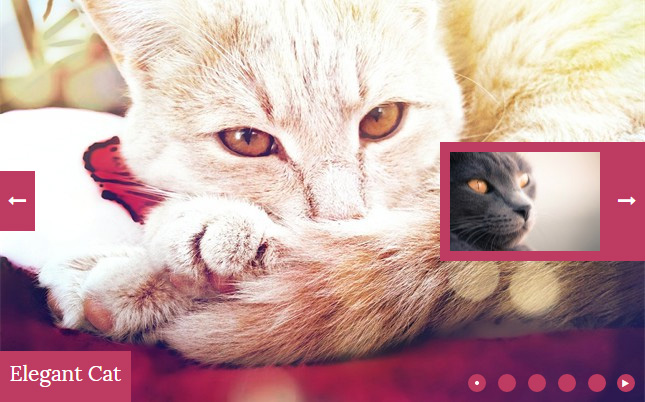
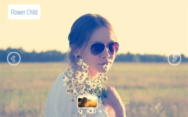
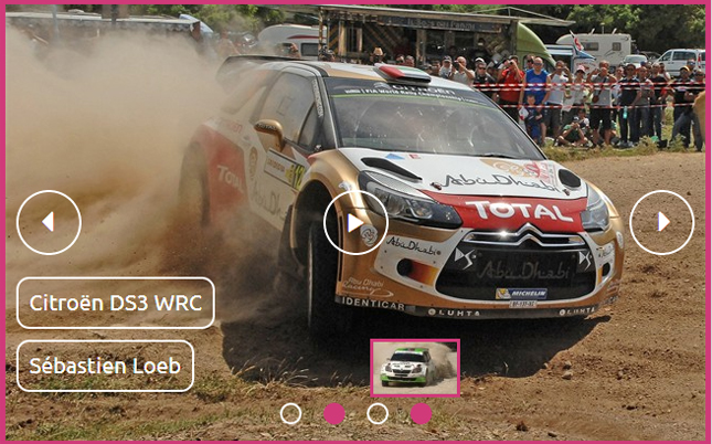
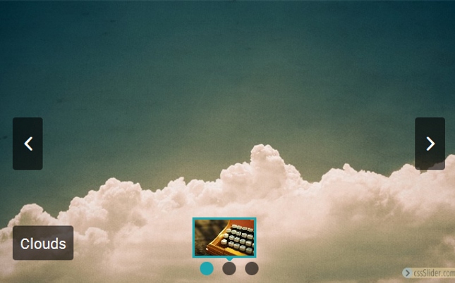
If you mouse-over the slideshow, additional elements appear. These are three semi-transparent grey boxes that are quite narrow and elongated. Within each box is a white icon. These icons ‘flip’ into place, like doors opening. The overall effect is stylish and modern.
Hovering over one of the icons causes it to turn blue and expand into a square. In the case of the two arrows, the rectangle grows in width to meet the edge of the slider. This has two results: firstly it makes it clear that you can interact with the icons, and secondly it creates a larger target area — making them easier to use, particularly on smaller screens.
Clicking on the icons allows the user to cycle forward and back through the slideshow, and pause/play the slideshow.
It is also possible to skip to any slide in the show by using the bullet navigation at the bottom of the slider. This is a set of grey circles, each one representing an image in the slideshow. As each image loads, the relevant circle turns blue. When you hover over a circle, a preview image ‘flips up’ from a bottom hinge — mimicking the other UI elements. As you would expect, clicking on a circle loads the relevant image.
There is a title and a sub-title in the bottom left corner. The title is white text on a semi-transparent grey rectangle, and the sub-title is white text on a blue rectangle. Both rectangles flip in from a top hinge. The text uses the sans-serif font ‘Roboto’; a natural and friendly feeling font that does not sacrifice legibility.
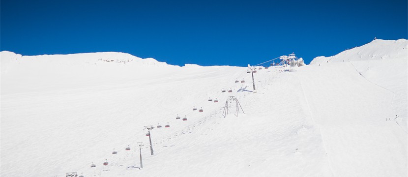
Overall this design is extremely flexible, and could be used for a wide-range of websites including blogs, e-commerce sites, travel and tourism sites and so on. It is attractive and modern, and guarantees your visitors will have a positive first impression. The colors work well together, although you can of course change them in cssSlider to better match your website scheme if required.