Using the advanced options in CSSSlider
Whilst you can create an excellent and fully fuctional slider quickly and easily using just the options in the main screen, there is also extended fuctionality under an advanced settings panel that allows you to do things such as hide/show the navigational elements, alter the appearance of the bullet navigation and preview images and change how the slider is saved and published.
You can open the advanced settings in cssSlider by clicking on the large button at the bottom of the right hand panel that says 'Advanced'. The button has an icon of a gear on a yellow circle.
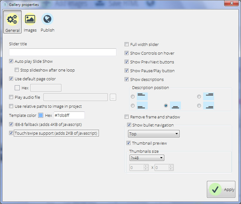
1. General settings
Under general settings you will find most of the settings for the slider itself.
Slider title
Slider title allows you to change the name of the slider.
Auto play Slide Show
This box is ticked by default. When the option is ticked, the slideshow begins automatically. If it is unticked, the user needs to click the 'play' button before the slideshow will begin.
Stop slideshow after one loop
This setting is unticked by default. When ticked, the slideshow will go through all the images in the sequence one time and then stop, until the user presses play again or interacts with the slider in some other way. When unticked, the slideshow will play on a continuous loop without stopping.
Use default page color
When ticked, this will set the background color of the preview window of cssSlider to a neutral grey. However, if you untick it, you can then change the background color. This allows you to see what your slider will look like on a background similar to your website. This enables you to check that, for example, dark images in the slideshow won't get lost on a black background or that the colors of your slideshow don't clash with your main website background.
To select a color for the background, click on the square next to the hex input code to display the 'color picker' tool. Alternatively you can enter the html hex value directly.
After you click apply, the window background will change in the preview section of cssSlider.
Play audio file
Play audio file allows you to add background music or an audio description to your slideshow. By default, it is unchecked. To add a soundtrack or audio file, tick the box. Then enter the direct url to the audio file, or click on the 'three dots' button next to the text box to open the file browser and find the audio file on your computer.
Use relative paths to image in project
This setting allows you to specify if you want exact paths or relative paths to the images. Relative paths allow you to upload the HTML code directly to your web server without altering the generated code.
Exact paths will mean the slider only works on your own computer or in a localhost environment unless you edit the paths within the generated code to point to the correct location.
You may want to use the exact paths if, for example, you had a localhost server on a kiosk and wanted a slideshow to play as part of the kiosk display. You may also want to use exact paths if you are comfortable editing the code.
Template color
This allows you to change the color scheme of the slider skin, in the same way that you can change it from the right hand panel in the main screen.
You have the option of adding a html Hex code directly, or using the color picker tool.
IE6-8 fallback
CSS-only sliders work in all modern browsers. However, if your audience still uses older browsers including Internet Explorer versions 6-8, you will need to add a few lines of javascript to ensure your slider displays properly.
By default this box is ticked, and the slider will include an additional 4kb of javascript code. If you untick this box, your slider may not display properly in older browsers.
Touch/swipe support
If a lot of your audience are using smartphones and tablets to interact with your slider, you can add support for touch/swipe controls. To do this, tick the box called 'Touch/swipe support', which will add a small amount of javascript that will enable these gestures to be used on touch-enabled devices.
Touch/swipe support can also be useful on kiosk-style touchscreens in museums and similar environments, if you are using slideshows as part of your interpretation.
Full width slider
A full-width slider will take up all available horizontal space, and as a result fill the window. To enable this, tick the 'Full width slider' checkbox. Be aware that on widescreens, this will mean your slider may look quite 'letterboxed', so make sure you have images that work well in a panoramic layout. Landscapes work especially well in full-width sliders.
Show controls on hover
By default, the navigational elements e.g. play/pause button and Prev/Next arrows will only appear when a user hovers over the slider. To change this behavior, untick this box. This will force the navigational elements to display at all times.
Show Prev/Next buttons
Enable/disabling this setting will turn on or turn off the navigational arrows on the slider. When turned off, the arrows will not appear, and the user will not be able to skip forward or backward.
Show Pause/Play button
Enabling/disabling this tickbox will turn on or turn off the Pause/Play button. Turning it off means the play/pause button will not appear, and the user will not be able to pause or resume the slideshow. If you disable the pause/play button, remember to make sure that the slider will start playing automatically!
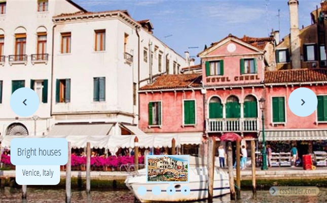
Show descriptions
The captions for each slide can be turned on and off by changing this setting. When unchecked, the captions will not show on the slideshow. You can also change the position of the description here.
Remove frame and shadow
Many of the skins you can choose from have a frame around the images and a shadow on the slider to help lift it off the page and create a three-dimensional effect.
You can get rid of the frame and shadow by ticking this checkbox.
Show bullet navigation
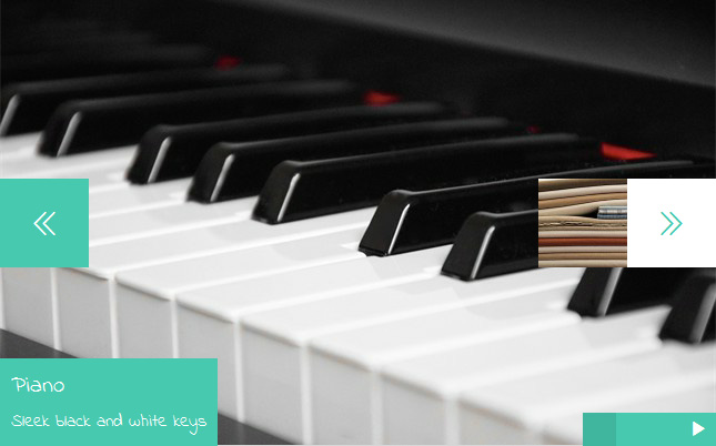
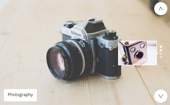
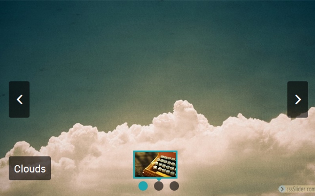
The bullet navigation allows the user to skip to the exact slide or image they want to see. You can turn it off completely by unticking this box or you can leave it ticked, and change where the bullet navigation appears on the slider. Use the dropdown menu to select where you want the bullets to appear e.g. top or bottom.
Thumbnail preview
By default, when the user hovers over the bullets in the bullet navigation, a preview thumbnail appears to show them which slide is linked to that bullet. You can turn off the thumbnail preview by unticking the box. If you leave the box ticked, you can change the size of the thumbnail previews. To do this, use the 'Thumbnails size' drop down box and select the size you want. If you select 'custom size', you can add the width and height in pixels directly. The question mark “?” in the drop drop down means that this dimension (width or height) will be calculated automatically based on the slide aspect ratio.
2. Image settings
The 'images' tab in the settings panel allows you to control different settings for the images used in the slideshow.
Skins
This section allows you to change which skin is being used by the slider. You can pick from a range of different styles and apply them to your slider. After you apply the new style, you can preview how it looks in the main window.
Image size
Image size allows you to edit the overall size and ratio of your slideshow. Use the dropdown box to select an appropriate size for your images based on where you intend for the slideshow to display. Remember that, as cssSlider is responsive, images will shrink if the screen is not big enough to display them at the full size.
You also have some advanced settings that you can apply to your images in this section:
Preserve aspect ratio
By unticking this box, images will no longer maintain their aspect ratio when resized. This can lead to distorted or 'stretched' looking images, so use with care.
Stretch small images
This will increase the size of small images in order to fill the full size of the slider. This can lead to pixelated looking images if the images are too small, so use with care. You are better off using larger images if possible.
Shrink large images
By default, cssSlider will keep images at their natural size and cut off the parts of the image that are too large for the slider. If you tick this box, images will be shrunk to fit the slider dimensions.
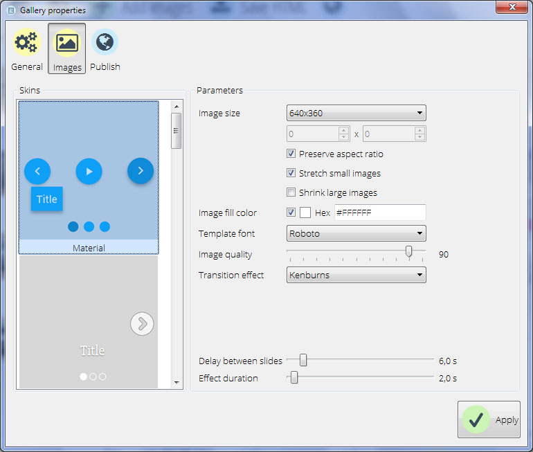
Image fill color
If you set the slider to not resize images, you may be left with blank space where the image does not fill the slider completely because it is the wrong shape or size. You can set the preferred color for this blank space by changing the image fill color.
You could use the same color as your website background, to make it blend in, or a contrasting color to give the slideshow a consistent size even if the images are not consistent.
To select a color, either enter the Hex code directly or click on the square button to load the 'color picker' screen and access your saved custom colors.
Template font
There are a lot of fonts that can be used to make your description look stylish and modern.
Image quality
By decreasing the image quality, you reduce the size of the images and make the slider faster to load. However, you also lose detail in the images. By default the image quality is set to be very high, but you can reduce that here by using the slider.
Transition effect
You can edit the transition effect by using this drop down menu. The transition effect is the way in which one slide is replaced by another slide, e.g. by fading in/out, by a new slide sliding in, etc. Use the drop down menu to select the one you want to use.
Delay between slides
This slider controls how long each slide is displayed for before being replaced by the next one. Adjust the slider to change the delay time in seconds. You may want a longer delay for complex images or slides with lots of text, or a shorter delay time for simple or atmospheric slides.
Effect duration
This slider controls how long it takes each slide to transition to the next. You can adjust this slider to change the duration in seconds. A fast transition is energetic and dynamic, while a slow transition will be calmer and more peaceful.
3. Publish settings
The publish settings tab allows you to change settings that control what happens when you publish the completed the slider.
Publish to folder
By default, cssSlider will save the HTML and slider images into a folder on your computer. You can change which folder it uses here.
Click on the 'Browse' button and navigate to the folder where you want the HTML and images from the slideshow to be saved. This could be a folder within the local copy of your website, for example, or a folder within a localhost server setup.
Publish to FTP server
You may want to skip saving the slider to your computer, and instead save it directly to the server where your website is located via FTP.
You will need to know your FTP server settings before you can use this.
Select this option, and then click on 'Edit' to add a new FTP server or to edit an existing one you have previously saved. Click 'Apply' when you have finished.
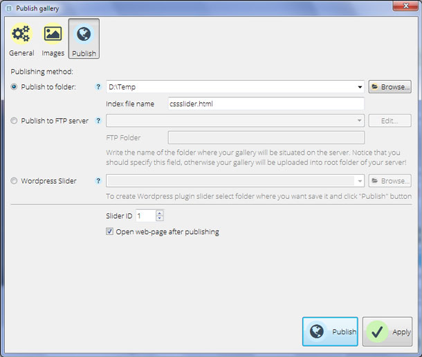
Wordpress Slider
You can save your Slider as a Wordpress plugin. This is particularly useful if you don't have direct access to your website via FTP .
Select this option, and then browse to the location on your computer where you want the plugin to be saved. Click 'Apply' when you have done.
Slider ID (Only applies to slideshows saved on the local computer)
By default, the first slider you create will have an ID of '1'. You can change this to whatever number you want.
Open web-page after publishing (Only applies when saving slideshows onto the local computer)
If you don't want the slideshow to open in a browser as soon as you have saved it, you can uncheck this option. Otherwise, after publishing your slideshow it will automatically open in a browser for you to check it works as expected.