

Zoom Effect & Convex Skin Carousel Jquery
This cssSlider template for a website slideshow is clean and simple, but contains a dash of organic motion that stops it from feeling too cold and clinical. The use of dark grey and turquoise is stylish and attractive, and creates a color scheme that is flexible enough to be used for a wide-range of websites.
The carousel itself is tall and square-ish, creating maximum impact as well as allowing the template to be used with a wide-range of images (not just landscape). There is no border or shadow effect, which means the template can be used against any background color. It also adds to the clean and simple look of the slideshow.
Each image in this jQuery-free carousel fades into view, as the ‘camera’ zooms out slowly. The image pauses for a moment, and then fades and zooms in the reverse direction. This transition effect is smooth and attractive, without being overly complicated and distracting.
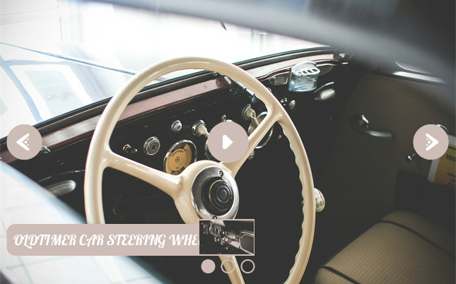
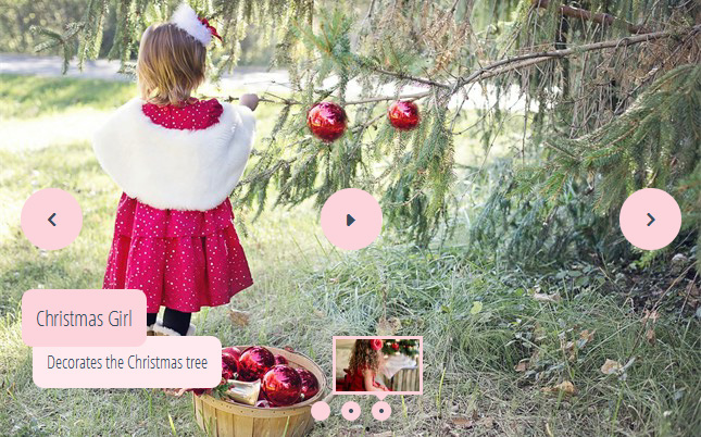
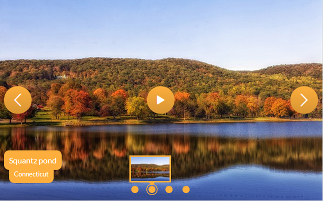
There are two ways to navigate through the slideshow. The first is via the use of navigational arrows. These arrows only appear when you hover over the slideshow. A thin turquoise arrows sit in the center of a dark grey square. This square fades and drops into place when the user hovers over the slideshow, and lifts and fades away when the user stops interacting with the slideshow.
When the user hovers over the arrow, there is another interesting effect. The square ‘turns over’, like a cube, to a different side which has the colors in reverse. Again, it’s a simple effect that goes a long way to making this template stand out from the crowd.
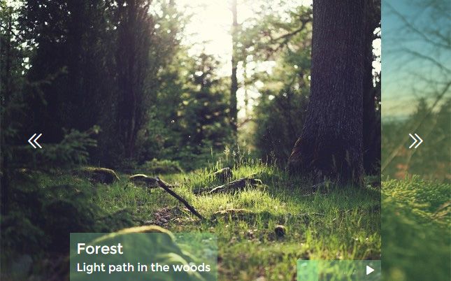
The second way to navigate through the slideshow is via the small squares at the bottom center of the carousel jQuery. Each square represents a slide in the slideshow, and hovering over them brings up a preview of that slide. Clicking on the square allows you to jump immediately to that image.
These squares are also grey, with the slide representing the current slide in turquoise. A similar effect to the navigational arrows is used on the squares: when the user hovers over one, it turns over like a cube, showing a different ‘face’, that is turquoise.
Finally, there is a caption in the right-bottom corner of the slideshow. This caption is in two parts, the title is in all-caps, and the sub-title is in normal case. Each title is turquoise writing on a dark grey square. These squares ‘pop’ into place, with just a small ‘bounce-back’ at the end that gives the a motion a very organic and natural feel.
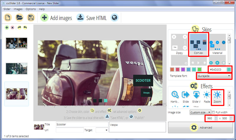
The captions use the font ‘Gurajada’, which is a clean font that retains a hand-written feel. It is easy to read, and works very well with this simple, minimalist but organic looking slideshow template.
The carousel uses pure css3 for all the transition effects, there is no jQuery, javascript or even any UI images. As a result, the carousel is fast to load, even on slow connections. It is also fully responsive, working on tablets and smartphones. It is the perfect no-jQuery carousel template for a modern website.
If you want a slideshow theme for your website that is understated elegance, you need look no further than this beautiful template from cssSlider.
The slideshow is smooth, clean and minimalist, however the use of turquoise and dark grey gives the design a warmth and a dash of style that is often missing from minimalist designs. This warmth is reinforced through the use of the font ‘Gurajada’, which is a clean handwriting font that works well with this template.
As with all slideshow themes from cssSlider, the theme is 100% pure CSS - no JQuery or Javascript, and no image icons to slow down your website. The result is a theme that is lightening fast and with extremely smooth transitions.
The slideshow is quite large and fairly square in shape — ideal for a website that wants to put the focus on the images.
When you first look at the slideshow, you see the ‘bullet navigation’ at the bottom center of the image, and the caption in the bottom-right corner.
The bullet navigation is made up of dark grey squares. Each one represents an image in the slideshow. When that image is active, the square turns turquoise. Hovering over a square brings up a preview of the relevant image, and clicking on the square loads that image into the slideshow — enabling the user to skip to the image that interests them the most.
The caption comprises of two dark grey boxes, one for a title and one for a subtitle. These ‘pop’ into place with each new image, the transition effect is smooth and organic, with a little ‘bounce back’ at the end of the effect. The text is turquoise, with the main title in capitals and the subtitle in a smaller font-size.
Hovering over the slideshow brings up additional navigation options. Two dark-grey squares drop into place on each edge of the slideshow. They have a turquoise arrow-head, and when you hover over them they flip over like a cube to reveal a side with the colors inverted.
Clicking on the arrow-head allows the user to navigate through the images in the slideshow.
The transition effect on the images in the slideshow is a slow fade. The first image fades and zooms out, whilst the new image fades and zooms in. The result is simple but effective, with the fade not distracting attention from the images.
Because of the clean design and elegant simplicity, this theme would be great for websites selling luxury products such as automobiles, jewelry or high-class food. Fashion websites would also benefit from the large size of the images and the way the theme allows the images to take most of the attention.
Mobile friendly website will also benefit from the modern build that takes full advantage of CSS3 and HTML5.