Bootstrap Alert Message
Overview
The alerts are created by these components you even don't think of as far as you actually get to require them. They are put to use for providing prompt in time responses for the user working with the web site hopefully pointing his or hers focus on a specific direction or evoking certain actions.
The alerts are most commonly used along with forms to give the user a recommendation if a area has been filled in improperly, which is the correct format expected or which is the status of the submission as soon as the submit button has been pressed.
As the majority of the elements in the Bootstrap framework the alerts also do have a nice predefined look and semantic classes which may possibly be used according to the particular scenario where the Bootstrap Alert Message has been displayed on screen. Since it's an alert message it is necessary to take user's care but however keep him in the zone of comfort nevertheless it might even be an error message.
This gets fulfilled by use of light pastel colours each being intuitively been connected to the semantic of the message information such as green for Success, Light Blue for general information, Light yellow desiring for user's focus and Mild red mentioning there is in fact something wrong.
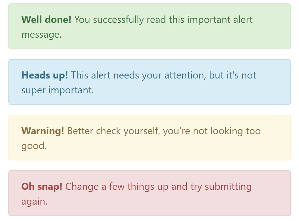
<div class="alert alert-success" role="alert">
  <strong>Well done!</strong> You successfully read this important alert message.
</div>
<div class="alert alert-info" role="alert">
  <strong>Heads up!</strong> This alert needs your attention, but it's not super important.
</div>
<div class="alert alert-warning" role="alert">
  <strong>Warning!</strong> Better check yourself, you're not looking too good.
</div>
<div class="alert alert-danger" role="alert">
  <strong>Oh snap!</strong> Change a few things up and try submitting again.
</div>
Coloration of the web link
It really may possibly not be noticed at a quick look but the font color also is in fact following this coloration too-- just the color tones are much much darker so get unconsciously taken dark however it's not exactly so.
Same goes not only for the alert text message in itself but as well for the web links included in it-- there are link classes removing the outline and painting the anchor elements in the correct colour so they suit the overall alert text appearance.
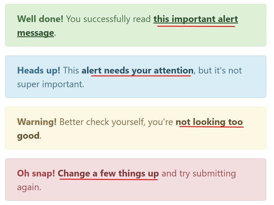
<div class="alert alert-success" role="alert">
  <strong>Well done!</strong> You successfully read <a href="#" class="alert-link">this important alert message</a>.
</div>
<div class="alert alert-info" role="alert">
  <strong>Heads up!</strong> This <a href="#" class="alert-link">alert needs your attention</a>, but it's not super important.
</div>
<div class="alert alert-warning" role="alert">
  <strong>Warning!</strong> Better check yourself, you're <a href="#" class="alert-link">not looking too good</a>.
</div>
<div class="alert alert-danger" role="alert">
  <strong>Oh snap!</strong> <a href="#" class="alert-link">Change a few things up</a> and try submitting again.
</div>
More facts for alerts
A aspect to indicate-- the colours come with their clear meaning just for those who in fact get to check out them. It's a good thing to either make sure the visible text itself carries the meaning of the
alert well enough or to eventually add some additional descriptions to only be seen by the screen readers in order to grant the page's accessibility.
In addition to links and basic HTML tags like strong as an example the alert elements in Bootstrap 4 can also include Headings and paragraphs for the situations when you desire to showcase a bit longer information.
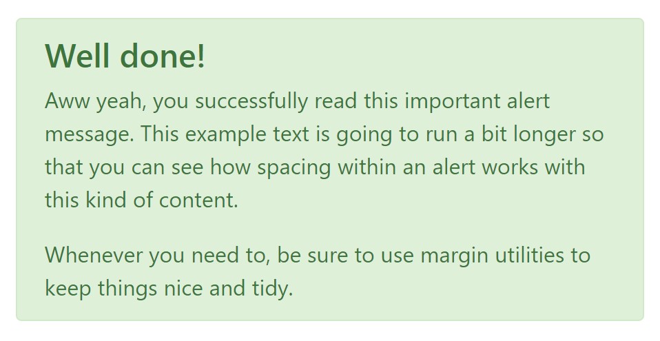
<div class="alert alert-success" role="alert">
  <h4 class="alert-heading">Well done!</h4>
  <p>Aww yeah, you successfully read this important alert message. This example text is going to run a bit longer so that you can see how spacing within an alert works with this kind of content.</p>
  <p class="mb-0">Whenever you need to, be sure to use margin utilities to keep things nice and tidy.</p>
</div>
Dismiss the alert
Once more ensure the visual comfort of the visitors, you can also add an X icon to dismiss the alert and add a cool transition to it to.
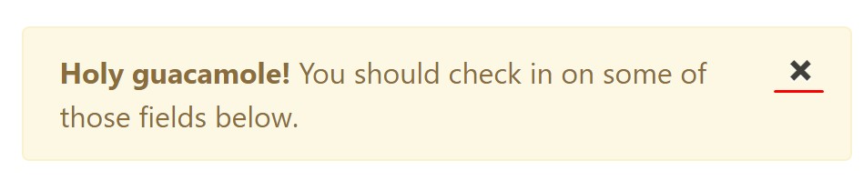
<div class="alert alert-warning alert-dismissible fade show" role="alert">
  <button type="button" class="close" data-dismiss="alert" aria-label="Close">
    <span aria-hidden="true">×</span>
  </button>
  <strong>Holy guacamole!</strong> You should check in on some of those fields below.
</div>
Currently there are four kinds of contextual alert messages in Bootstrap 4 framework - they are called Success, Info, Warning and Danger. Do not let however their titles to narrow down the way you're working with them-- these are just some color schemes and the method they will be actually performed in your site is totally up to you and absolutely depends on the specific situation.
-- if the color scheme of your page utilizes the red as main color it might be quite appropriate to display the alert for successful form submission in red too using the predefined alert danger appearance in order to better blend with the page and save some time defining your own classes.
Anyway the predefined alert classes are nothing but some consistent looks and the responsibility for working with them lays entirely on the designer's shoulders.
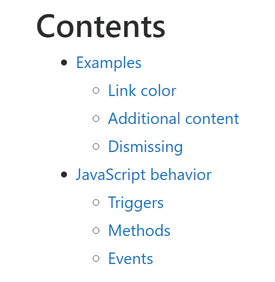
JavaScript activity of the Bootstrap Alert Popup
Triggers
Enable termination of an alert through JavaScript
$(".alert").alert()
Enable removal of an alert using JavaScript
Or else with data features on a button inside the alert, as illustrated just above
<button type="button" class="close" data-dismiss="alert" aria-label="Close">
  <span aria-hidden="true">×</span>
</button>
Note that shutting an alert will remove it from the DOM.
Solutions
$().alert() - Helps to make an alert listen for mouse click events on descendant elements which in turn have the data-dismiss=" alert" attribute. When using the data-api's auto-initialization.), (Not necessary.
$().alert('close') - Turns off an alert by removing it from the DOM. The alert will fade out just before it is removed if the.fade and.show classes are available on the element.
Events
Bootstrap's alert plugin makes vulnerable a couple of events for hooking in to alert functionality.
close.bs.alert- When the close instance method is called, this event fires immediately.
closed.bs.alert- When the alert has been closed (will wait for CSS transitions to, this event is fired).
Review several on-line video information about Bootstrap alerts
Linked topics:
Bootstrap alerts approved documentation
W3schools:Bootstrap alert tutorial
Bootstrap Alert Issue
W3schools:Bootstrap alert tutorial
Bootstrap Alert Issue