


Slide Verical Transition & Boundary Style Parallax Slider
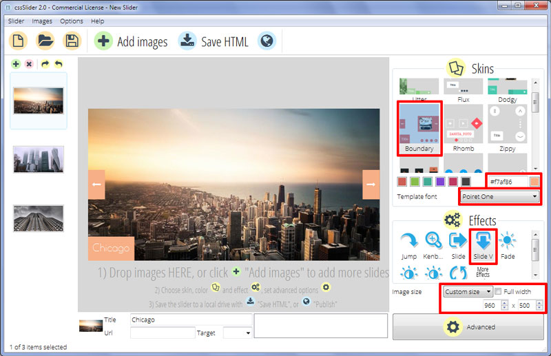
This slider template from cssSlider is a dramatic template that uses a peach and white color scheme and bold, geometric shapes to draw attention and make a statement.
As with all templates from cssSlider, the design is responsive. On smaller devices the images resize to fit the screen, and some of the UI elements disappear to make the slider more useable. On larger screens, the images take up the full amount of space available and the UI elements reappear. This means the slider works on smartphones, tablets, laptops, desktop computers, and even smart TVs.
In addition, because the slider uses HTML5 and CSS3 rather than JQuery or JavaScript, the template is extremely fast to load - with all the benefits that brings to your website. Loading time is increasingly a factor in SEO, and on mobile devices a short load time means your visitors are much more likely to stay on your website.
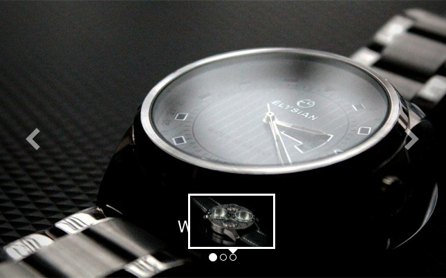
The images in the slideshow are large and slightly more square than many other slider templates out there. This provides much greater flexibility in terms of the images you can use within your slider.
Each image transitions by rising slowly from below, as though each image is on a spool being wound up. This effect is reinforced by the fact that, at the end of the slideshow, the images ‘rush’ back to the beginning.
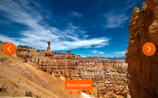
On the left and right hand sides of the slider are two peach colored rectangles that nestle against the side of the image. Hovering over these rectangles causes them to expand in both directions and a preview of the next or previous image in the slideshow to appear. You can click the arrow to then load this image. It’s a powerful way of navigating the slider.
In the left corner, nestled against the corner of the image, is a caption on a peach rectangle. This caption slides in from the left as the image in the slideshow changes. It also features a fade in. It’s a nice affect, that isn’t too distracting. The text is in white, and uses a lovely geometric font called Poiret One. It’s light, sleek and simple and works brilliantly with the other bold shapes in the slider template.
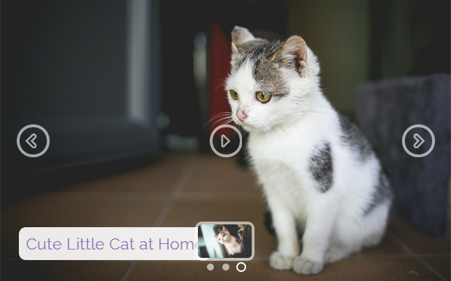
This slider does not have a play/pause button or bullet navigation, though these can be added if needed by using cssSlider. The absence of the extra UI elements however helps to create the bold simplicity of this theme, and also gives more space to the images.
The slider could be used in many different kinds of websites, but is particularly suited to IT and tech sites, thanks to its modern, sleek look and to stylish fashion or high-end luxury e-commerce websites thanks to it’s bold choice of design elements and colors.